Table of Contents
Introduction
The apave software provides a sort of geometry manager for Tcl/Tk.
The apave isn't designed to replace the existing Tk geometry managers (place, pack, grid). Rather the apave tries to simplify the window layout by using their best, by means of:
- uniting a creation of widgets with their layout (and mostly their configuration)
- minimizing a coder's efforts at creating / modifying / removing widgetssetting a natural tab order of widgetsproviding 'mega-widgets'providing 'mega-attributes', right up to the user-defined onescentralizing things like icons or popup menustheming both ttk and non-ttk widgets
Along with standard widgets, the apave objects can use a batch of following 'mega-widgets':
Also, apave provides a bundle of nice little things like:
- button / label with a bound command to fire after a timeout
- progress form for a boot process presumably long
- blinking widgets to draw attention
- default context menus for entries and texts, incl. read-only ones
- configurable balloon messages and tooltips
- tagged texts
- changing images and links embedded into texts
- 25 light and 25 dark color schemes, optionally tinted
- 74 icons (small & large) for a good deal of occasions
- customized dimensions of Tcl/Tk Unix's file / directory choosers and enhanced color / date choosers
- integration with e_menu to expand an application's facilities
- opening dialogues as modal / non-modal, closed / not closed with Escape key
- simple
[pobj Widget]instead of messy.win.fra1.fra2.and_so_on.widgetfor configurable widgets - Hungarian notation for widget names consistently divided into ttk and non-ttk widgets
The apave is implemented as APave oo::class, so that you can enhance it with your own inherited / mixin-ed class.
The theming facility of apave is enabled by ObjectTheming oo::class which embraces both ttk and non-ttk widgets, as seen on Demo.
Note that bartabs, baltip and hl_tcl are contained in apave package as sort of subpackages and can be used independently.
On the other hand, having installed apave, you need not to install bartabs, baltip and hl_tcl.
There is one pitfall at this: if you use Magicsplat or BAWT Tcl/Tk distribution, you can find that they are including a bit obsolete version of apave or one of its subpackages. Or their versions aren't what you rely on. In this case, you should dismiss the preinstalled packages and likely use source for the main script of the package (apave.tcl for apave), this way:
foreach _ {apave baltip bartabs hl_tcl} {
  catch {
    package forget $_
    namespace delete $_
  }
}
unset -nocomplain _
source ./apave/apave.tcl
In fact, apave has been intended for those programmers who (like me) are too lazy in order to dig in the endless interference of grid and pack, the widget pathes and, most dreadful of all, the belated modifications of GUI.
The apave originates from the old pave package, to comply with How to build good packages ("avoid simple, obvious names for your namespace").
Let it be a sort of a-pave.
Idea of APave
The main idea of apave is that while inserting or removing a cell you need to have in mind only its neighborhood. This way of thinking is applicable to a creation as well as to a modification of layout.
For example, while adding a new widget cell to the layout you need to have in mind only its top (T) or left (L) neighbor, this way:
Just at the adding, while inserting a widget in the middle of layout, you think only of its relation to a future T (L) neighbor. Thus, you always think of widgets in terms of relations to their neighbors who as such are easily observable. You never evaluate the widgets' absolute rows/columns and all appropriate correlations.
Another advantage of this "T/L layout" is that it sets a natural tab order of widgets. When you insert a new widget, at the run time it would be selected with Tab key just from its T/L neighbor. Thus, Top/Left widgets would naturally pass their selection to their Bottom/Right neighbors.
The second idea of apave is to minimize your key-pressing which is achieved through:
- smart naming of the widgets
- abbreviating of the widgets options
- default settings of most popular options (perhaps the scroll options are most odious)
- providing the popular pickers (file, directory, color etc.) as 'mega-widgets'
In practice you pass to apave a list containing the records (lists also) of the following structure:
Widget name Neighbor name
(or "-")Position of neighbor
("L", "T" or "-")Row
spanColumn
spangrid/pack
optionsWidget
attributesFor example, this code sample
. . .
{but4 . . .
{sehC but4 T 1 1 {-st ews}}
{butC sehC T 3 1 {-st we} {-t "Close All" -com "exit"}}
. . .
means the creation and the gridding a horizontal separator (sehC) and a button (butC). The sehC spans 1 row and 1 column, while the butC spans 3 rows and 1 column. The "-st" option means "-sticky". The "-t" means "-text", the "-com" means "-command".Notice also that
- the widgets are related as "T" neighbors (but4 is above sehC that is above butC)
- the widget attributes are omitted in the sehC
- the grid/pack options and both spans (being 1 as default) can be omitted as well
- the neighbor options cannot be omitted, e.g. you can set
{h_ lab T}but not{h_ lab}as "T" sets the relation of "h_" to its "lab" neighbor.
Example of Use
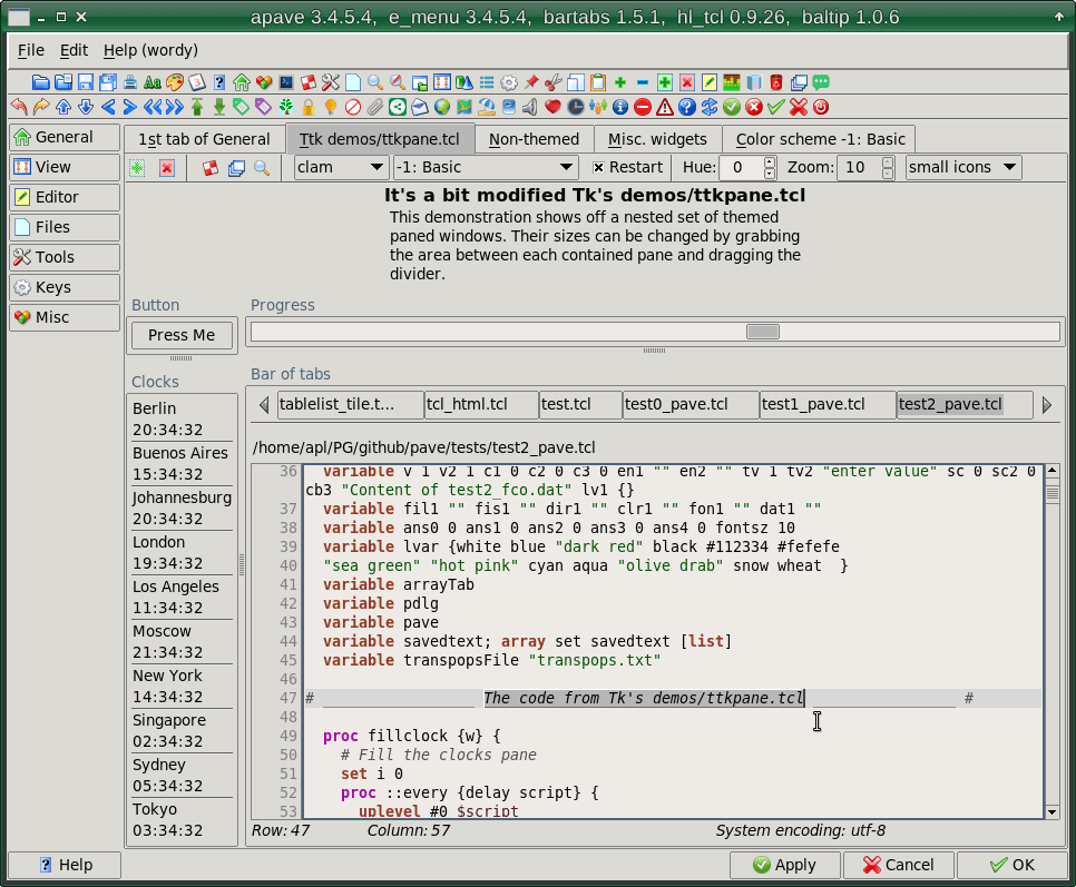
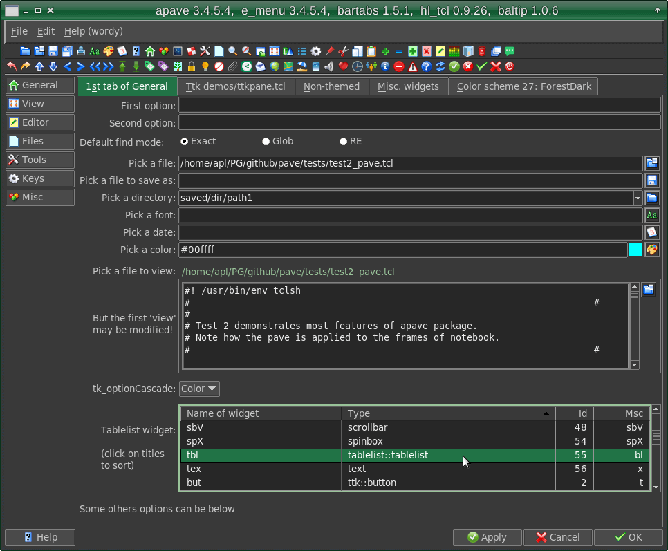
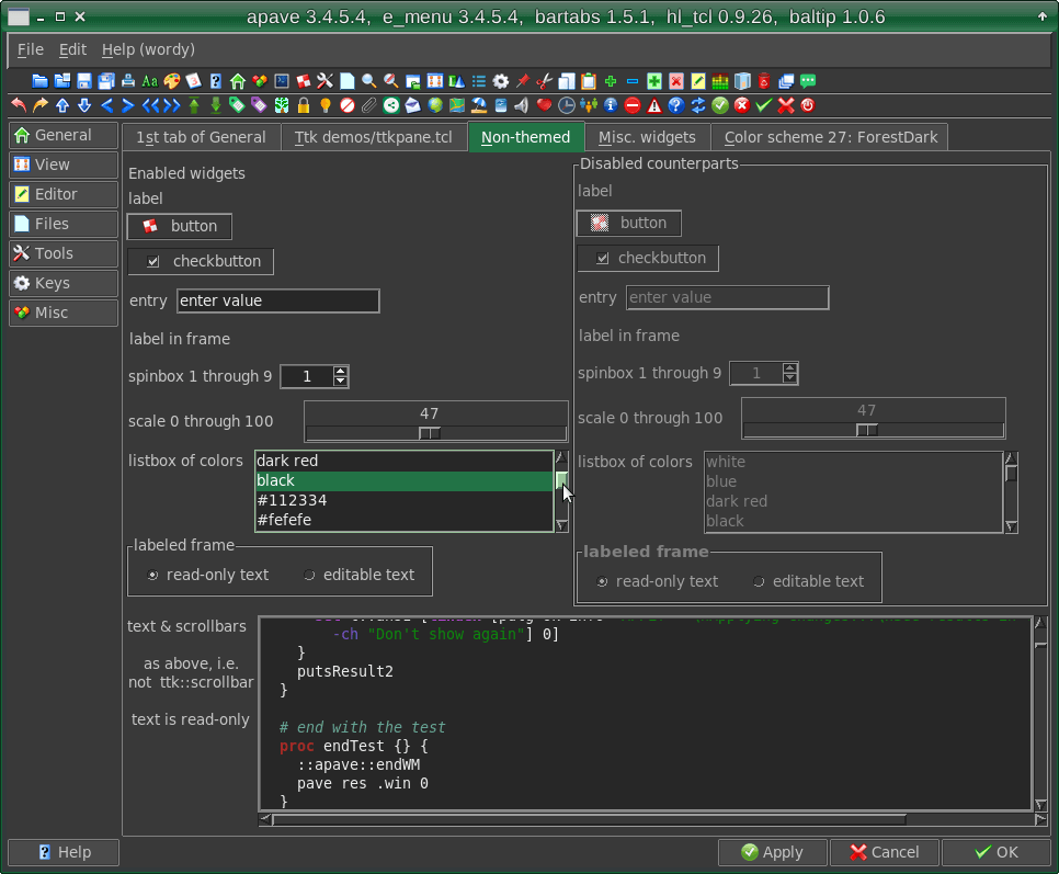
A detailed example of using apave is presented by test2_pave.tcl of downloaded apave_tests.zip. It covers most facilities of apave and can be used as a source of code templates.
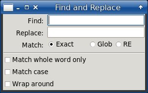
Here we use the apave to make the following trivial dialog:
It's created by this code:
package require apave
apave::APave create pave
set win .win
pave makeWindow $win.fra "Find and Replace"
set v1 [set v2 1]
set c1 [set c2 [set c3 0]]
set en1 [set en2 ""]
pave paveWindow $win.fra {
  {lab1 - - 1 1    {-st es}  {-t "Find: "}}
  {ent1 lab1 L 1 9 {-st wes} {-tvar ::en1}}
  {lab2 lab1 T 1 1 {-st es}  {-t "Replace: "}}
  {ent2 lab2 L 1 9 {-st wes} {-tvar ::en2}}
  {labm lab2 T 1 1 {-st es} {-t "Match: "}}
  {radA labm L 1 1 {-st ws} {-t "Exact" -var ::v1 -value 1}}
  {radB radA L 1 1 {-st ws} {-t "Glob" -var ::v1 -value 2}}
  {radC radB L 1 1 {-st es} {-t "RE  " -var ::v1 -value 3}}
  {h_2 radC L 1 2  {-cw 1}}
  {h_3 labm T 1 9  {-st es -rw 1}}
  {seh  h_3 T 1 9  {-st ews}}
  {chb1 seh  T 1 2 {-st w} {-t "Match whole word only" -var ::c1}}
  {chb2 chb1 T 1 2 {-st w} {-t "Match case"  -var ::c2}}
  {chb3 chb2 T 1 2 {-st w} {-t "Wrap around" -var ::c3}}
  {sev1 chb1 L 3 1 }
  {lab3 sev1 L 1 2 {-st w} {-t "Direction:"}}
  {rad1 lab3 T 1 1 {-st we} {-t "Down" -var ::v2 -value 1}}
  {rad2 rad1 L 1 1 {-st we} {-t "Up"   -var ::v2 -value 2}}
  {sev2 ent1 L 8 1 }
  {but1 sev2 L 1 1 {-st we} {-t "Find" -com "::pave res $win 1"}}
  {but2 but1 T 1 1 {-st we} {-t "Find All" -com "::pave res $win 2"}}
  {but3 but2 T 1 1 {-st we} {-t "Replace"  -com "::pave res $win 3"}}
  {but4 but3 T 1 1 {-st nwe} {-t "Replace All" -com "::pave res $win 4"}}
  {seh3 but4 T 1 1 {-st ewn}}
  {but5 seh3 T 3 1 {-st we} {-t "Close" -com "::pave res $win 0"}}
}
set res [pave showModal $win -focus $win.fra.ent1 -geometry +200+200]
puts "
  Entry1=$en1
  Entry2=$en2
  E/G/R=$v1
  CheckBox1=$c1
  CheckBox2=$c2
  CheckBox3=$c3
  Direction=$v2
  Result=$res
  "
pave destroy
destroy $win
Below we'll consider this code line by line.The 1-4 lines initialize
apaveobject that makes the.winwindow with "Find and Replace" title. The 5-7 lines initialize the variables used in the dialog. Still nothing special:1 package require apave 2 apave::APave create pave 3 set win .win 4 pave makeWindow $win.fra "Find and Replace" 5 set v1 [set v2 1] 6 set c1 [set c2 [set c3 0]] 7 set en1 [set en2 ""]
The 8 line callspave paveWindowmethod that is passed two arguments: the window name and the list of widgets' options. Thepave paveWindowdoes all layout work.
Note that the window name is passed as .win.fra, so we create a window named .win and a ttk::frame named .win.fra, thus we'll have the themed background. This way we save the keypressing like this: pack [ttk::frame $w] -expand 1 -fill both.
The 9 line createslab1label with text "Find:". It begins the layout so it has no neighbors and as such has "-" standing for neighborhood. The "-st es" means the "-sticky es" option.
The 10 line creates an entryent1where the "find string" would be entered. The neighbor ofent1is the left (L)lab1. We expect that theent1would be expanded while resizing the window so we set its columnspan to "9" and "-st wes". The textvariable receiving the input is::en1. Note that the variable should be fully qualified.
The 11-12 lines create the label and the entry for "replace string" and are similar to the previous.8 pave paveWindow $win.fra { 9 {lab1 - - 1 1 {-st es} {-t "Find: "}} 10 {ent1 lab1 L 1 9 {-st wes} {-tvar ::en1}} 11 {lab2 lab1 T 1 1 {-st es} {-t "Replace: "}} 12 {ent2 lab2 L 1 9 {-st wes} {-tvar ::en2}}Stopped by now we'd see the following dialog:
The 13-16 lines set the prompt and the radiobuttons titled "Exact", "Glob", "RE" (the matching modes at finding). Each of them has a left (L) neighbor, spans 1 row and 1 cell and has the textvariable::v1that would receive the input from them.13 {labm lab2 T 1 1 {-st es} {-t "Match: "}} 14 {radA labm L 1 1 {-st ws} {-t "Exact" -var ::v1 -value 1}} 15 {radB radA L 1 1 {-st ws} {-t "Glob" -var ::v1 -value 2}} 16 {radC radB L 1 1 {-st es} {-t "RE " -var ::v1 -value 3}}Stopped by now we'd see the following dialog:
The 17-18 lines set the horizontal spacers that are necessary to make the clear resizing of the window.
Theh_2spacer has "-cw 1" grid option which means that its spanned cells would be expanded while resizing the window. It's just we need because the cells would expand also the entry fields.
Theh_3spacer is located under the previouslabmlabel and has "-rw 1" grid option which means that its row would be expanded while resizing the window.
The 19 line sets the horizontal separatorsehthat spans 9 columns.
Just under the separator are located the checkboxes of find options. They are located one under another (T) and have the variables::c1,::c2,::c3for receiving their input.17 {h_2 radC L 1 2 {-cw 1}} 18 {h_3 labm T 1 9 {-st es -rw 1}} 19 {seh h_3 T 1 9 {-st ews}} 20 {chb1 seh T 1 2 {-st w} {-t "Match whole word only" -var ::c1}} 21 {chb2 chb1 T 1 2 {-st w} {-t "Match case" -var ::c2}} 22 {chb3 chb2 T 1 2 {-st w} {-t "Wrap around" -var ::c3}}Stopped by now we'd see the following dialog:
The 23 line sets the vertical separatorsev1that has the left (L) neighborchb1(checkbox "Match whole word only") and spans 3 rows.
In 24-26 lines we have a label ("Direction") and two radiobuttons of find direction.
The 27 line sets the vertical separatorsev2that has the left (L) neighborent1(find entry) and spans 8 rows.23 {sev1 chb1 L 3 1 } 24 {lab3 sev1 L 1 2 {-st w} {-t "Direction:"}} 25 {rad1 lab3 T 1 1 {-st we} {-t "Down" -var ::v2 -value 1}} 26 {rad2 rad1 L 1 1 {-st we} {-t "Up" -var ::v2 -value 2}} 27 {sev2 ent1 L 8 1 }Stopped by now we'd see the following dialog:
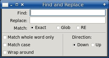
At last, we lay out the buttons. The firstbut1("Find") has a left neighborsev2, all others are located one under another. There is also a horizontal separatorseh3to separate the "Close" button from others.
The buttons have the commands ("-com") that set an internal variable of apave to the corresponding value (e.g. "::pave res $win 1" sets it to 1). Changing this variable would stop the window's event cycle.28 {but1 sev2 L 1 1 {-st we} {-t "Find" -com "::pave res $win 1"}} 29 {but2 but1 T 1 1 {-st we} {-t "Find All" -com "::pave res $win 2"}} 30 {but3 but2 T 1 1 {-st we} {-t "Replace" -com "::pave res $win 3"}} 31 {but4 but3 T 1 1 {-st nwe} {-t "Replace All" -com "::pave res $win 4"}} 32 {seh3 but4 T 1 1 {-st ews}} 33 {but5 seh3 T 3 1 {-st we} {-t "Close" -com "::pave res $win 0"}} 34 }So, in 34 lines we have created the full-featured "Find and Replace" dialog shown above.
While being resized the dialog behaves rather decently:
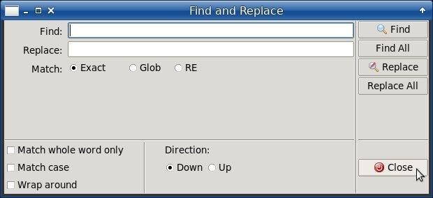
The line:35 set res [pave showModal $win -focus $win.fra.ent1 -geometry +200+200]
calls the dialog as modal passing it the window name, the focused field name and the geometry arguments (the last two may be omitted).
The main result (i.e. the pressed button's number) is returned toresvariable.
Other results are returned as the values of corresponding variables.
We should also delete the pave object if it would not be used farther.36 puts " 37 Entry1=$en1 38 Entry2=$en2 39 E/G/R=$v1 40 CheckBox1=$c1 41 CheckBox2=$c2 42 CheckBox3=$c3 43 Direction=$v2 44 Result=$res 45 " 46 pave destroy 47 destroy $win
The most remarkable feature of apave is the easy way of modifications.
Let's imagine e.g. we need the "Stay on top" checkbox in our Find/Replace dialog. As for the layout, we should only include 1 and modify 3 lines, this way:....... 23 {chb4 chb3 T 1 2 {-st w} {-t "Stay on top" -var ::c4}} 24 {sev1 chb1 L 4 1 } ....... 28 {sev2 ent1 L 9 1 } ....... 34 {but5 seh3 T 4 1 {-st we} {-t "Close" -com "::pave res $win 0"}}Note that we made only those modifications that are relevant indeed: inserting the new widget and incrementing the row spans of existing widgets. No calculations of rows, columns, weights etc.
The result: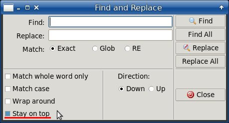
Use of APave
APave Object
The creation of a apave object and a paved window are rather straightforward. Firstly we package require apave, secondly we create the pave object, at last we make the window, this way:
package require Tk
package require apave
apave::APave create pobj
pobj makeWindow $win $title
wherewincontains the window's path,titlecontains the window's title.To populate ("pave") the window with widgets, the
paveWindowmethod is called, as discussed below.An apave object can be used for paving various windows. When you end a work with a window and close it, usually you destroy it. However, its paving apave object can be freely applied to another window.
This work flow is well fit for hierarchical modal dialogues. You keep, say, obDlg1, obDlg2, obDlg3... apave objects for 1st, 2nd, 3rd... levels. Thus, you have a control over how deep is your dialogues' chain, as getting it too deep (more than 4 levels) is a bad practice. If your design requires obDlg5 (or even obDlg4), it's really a cause to revise it.
Other dialogue windows may be open as non-modal, working independently. Their paving apave objects may be named more specifically, say obFind, obCheck etc. Some modal windows (like regular messages) can be paved specifically too, say, with obMsg object.
That said, one apave object cannot pave two windows simultaneously.
Widget List
The widget option list is passed to
paveWindowmethod as a second argument, this way:pobj paveWindow $win $widget_option_list
Thewidget_option_listis a list of lists of the following structure:Widget name Neighbor name
(or "-")Position of neighbor
("L", "T" or "-")Row
spanColumn
spangrid/pack/add
optionsWidget
attributeswhere:
Widget nameis a relative pathname of widget (e.g. butOK, fra1.lab1)Neighbor nameis a neighboring widget's pathname or "-" (no neighbor) or "#" (no neighbor and no grid/pack)Position of neighbormay be "L" (left neighbor), "T" (top neighbor) or "-" (no neighbor)Row spanis a rowspan grid option (optional, by default equals to 1)Column spanis a columnspan grid option (optional, by default equals to 1)grid/pack/add optionsis a grid/pack/add options (optional)
by default the options refer to the grid, however when the options begin with "pack", "pack forget" or "add" they refers topackoraddcommands (addcommand is used as add ?options? command of ttk::panedwindow)Widget attributesis a widget attributes according to its type e.g. "label", "ttk:button" etc. (optional)
The widgets are included in the list normally from top to bottom and from left to right. The widgets succession in the list defines their tab order in the window, so you can define the successive widgets according to your requirements.
The widgets should be previously defined in the list to use them as neighbors.
Widget Names
In apave, the initial three letters of widget name define its type. This method (sort of Hungarian notation) saves a lot of keypressing.
The compound widget paths have the widget type according to the tail (e.g.
fra1.but1is ofttk::buttontype).The ttk::widgets have the lower case patterns while their non-ttk counterparts have an uppercased 3rd letter (e.g.
butvsbuT).Also, a widget name can have a first letter in the upper case. Though prohibited by Tk, this will create the normal "lower-cased" widget and the appropriate method to access its path. For example:
apave::APave create ::pObj set ::win .win ::pObj makeWindow $::win.fra "Test" ::pObj paveWindow $::win.fra { {But1 - - 1 1 {} {-t "Button 1" -com {puts "Pressed [::pObj But1]"; ::pObj res $::win 1}}} {But2 but1 T 1 1 {} {-t "Button 2" -com {puts "Pressed [::pObj But2]"; ::pObj res $::win 2}}} } set res [::pObj showModal $::win] puts res=$res ::pObj destroy destroy $::winHere,::pObj But1and::pObj But2are used to access the appropriate widgets, i.e..win.fra.but1and.win.fra.but2. In real life, those paths can include more than 3 levels.The widget name patterns and their matters are presented in the table below.
Name pattern Widget type Default options Examples and comments bit* bitmap but* ttk::button If a button's name is formed as butIcon where Icon is one of apave icons, then the button gets this icon.
For example:butAdd, butSound. See apave icons in test2_pave.tcl of downloaded apave_tests.zip.
The-style TButtonWestand-style TButtonWestBoldattributes can be used for the but*.
Also, a button's -com attribute can be integer which means a returned result of showModal, e.g.{butRun - - 1 1 {-padx 4} {-com 1 -t Run -tip "Close & Run"}}buT* button See but* above. btT* tool button can* canvas chb* ttk::checkbutton chB* checkbutton cbx* ttk::combobox ent* ttk::entry enT* entry fra* ttk::frame frA* frame lab* ttk::label -st w -state disabledmay be usedlaB* label -st w lfr* ttk::labelframe lfR* labelframe lbx* listbox meb* ttk::menubutton meB* menubutton men* menu nbk* ttk::notebook {fra.nbk - - - - {pack -side top} { f1 {-text " 1st tab of General " -underline 2} f2 {-text " Ttk demos/ttkpane.tcl " -underline 1} f3 {-text " Non-themed " -underline 1} f4 {-text " Misc. widgets " -underline 1} f5 {-text " Color schemes " -underline 1} -traverse yes -select f2 }}in this list item:-traverse yesoption means that notebook is traversed (due to ttk::notebook::enableTraversal)-select f2option means that f2 tab of the notebook will be selected at openingpan* ttk::panedwindow pro* ttk::progressbar rad* ttk::radiobutton raD* radiobutton sbh* ttk::scrollbar -orient horizontal -st ew The pack GM is used for a scrollable text in a frame. Note also that no scrolling commands are set below.
The horizontal scrollbar "knows" that its top neighbor is a scrollable widget:{frAT fra1 T 1 2 {-st nsew -rw 1 -pady 7}} {frAT.textNT - - - - {pack -side left -expand 1 -fill both} {-h 11 -wrap none}} {frAT.sbv frAT.textNT L - - {pack}} {frAT.sbh frAT.textNT T - - {pack}}sbH* scrollbar -orient horizontal -st ew See sbh* above. sbv* ttk::scrollbar -orient vertical -st ns The pack GM is used for a scrollable text. Note also that no scrolling commands are set below.
The vertical scrollbar "knows" that its left neighbor is a scrollable widget:{fraD labD L 1 1 {-st nswe -padx 5} {}} {fraD.texD - - 1 1 {pack -side left -expand 1 -fill both} {-h 8 -w 50 -wrap word}} {fraD.sbv fraD.texD L 1 1 {pack}}sbV* scrollbar -orient vertical -st ns See sbv* above. sca* ttk::scale scA* scale seh* ttk::separator -orient horizontal -st ew sev* ttk::separator -orient vertical -st ns siz* ttk::sizegrip spx* ttk::spinbox spX* spinbox tbl* tablelist::tablelist -labelcommand tablelist::sortByColumn
-stretch allAn example of tablelist widget with label and scrollbar (from test2_pave.tcl of downloaded apave_tests.zip): {labtbl1 labBftx1 T 1 1 {-st e} {-t "Tablelist widget:"}} {frAT labtbl1 L 1 9 {-st ew -pady 15}} {frAT.Tbl1 - - - - {pack -side left -fill x -expand 1} { -h 7 -lvar ::t::tbllist -lbxsel but -columns {$::t::tblcols}}} {frAT.sbv frAT.tbl1 L - - {pack}}tex* text tre* ttk::treeview h_* frame -st ew -csz 3 -padx 3 The horizontal spacer. v_* frame -st ns -rsz 3 -pady 3 The vertical spacer.
There are two special types of widget names:
- Names beginning with # character mean comments; this is useful when you need to disable some widgets and view a layout without them.
For example, to hide the vertical scrollbar of the last example, we might just comment it out:
{labtbl1 labBftx1 T 1 1 {-st e} {-t "Tablelist widget:"}} {frAT labtbl1 L 1 9 {-st ew -pady 15}} {frAT.Tbl1 - - - - {pack -side left -fill x -expand 1} { -h 7 -lvar ::t::tbllist -lbxsel but -columns {$::t::tblcols}}} {#frAT.sbv frAT.tbl1 L - - {pack}} -
The very first item being
{after idle}or{after msec}wheremsecis milliseconds - this means that a window (frame or notebook tab) has to be populated with its widgets "after idle" or "after a pause"; this would be useful when you have multiple frames/tabs and want to layout those invisible after a pause imperceptible for a user, saving his/her time.
For example, the widget list might begin as:set widlist_of_tab(2) { {after 500} {v_ - - 1 1} {fra v_ T 1 1 {-st nsew -cw 1 -rw 1}} {fra.ScfRuns - - 1 1 {pack -fill both -expand 1}} {# ...} {# other widgets} {# ...} }Here, tab(2) will be in fact created after 0.5 sec delay, supposedly after tab(1) would have been already displayed, first. A user will not notice the delay caused by tab(2) creation.
Mega-Widget Names
The pickers (fil, fis, dir, fon, clr) have counterparts with a combobox instead of an entry.
Name pattern Widget type Examples and comments fil* file picker file picker (see below in Mega-Widgets) fiL* file picker with combobox file picker with combobox fis* 'file to save' picker saved file picker (see below in Mega-Widgets) fiS* 'file to save' picker with combobox saved file picker with combobox dir* directory picker directory picker (see below in Mega-Widgets) diR* directory picker with combobox directory picker with combobox fon* font picker font picker (see below in Mega-Widgets) foN* font picker with combobox font picker with combobox clr* color picker color picker (see below in Mega-Widgets) clR* color picker with combobox color picker with combobox dat* date picker date picker (see below in Mega-Widgets). daT* calendar calendar (see below in Mega-Widgets). men* menubar menubar containing items (see below in Mega-Widgets) too* toolbar The toolbar containing images and commands (see below in Mega-Widgets)
Note that h_* (spacer) and sev* (vertical separator) can be used in -array options of the toolbar widget.
In these cases the h_* and sev* are followed with widths.
See examples in test2_pave.tcl of downloaded apave_tests.zip, as shown below.sta* status bar see its description below bts* bar of tabs see its description below fco* file combobox file content combobox (see below in Mega-Widgets) flb* file listbox file content listbox (see below in Mega-Widgets) ftx* file viewer/editor file content viewer/editor (see below in Mega-Widgets) gut* gutter see its description below opc* option cascade see its description below. scf* scrolled frame see its description below swi* switch see its description below tcl Tcl code to add items
to a widget list.The "tcl" type can be used to make a list of similar widgets.
The%Cwildcard is a placeholder forlappend lwidgetscommand.
The example below is taken from test2_pave.tcl of apave_tests.zip:{tcl { set prt BuTClrB for {set i 0} {$i<48} {incr i} { set cur "BuTClr$i" if {$i%4} {set n $pr; set p L} {set n $prt; set p T; set prt $cur} set pr $cur set lwid "$cur $n $p 1 1 {-st nsew -rw 1 -cw 1} {-com \ {::t::toolBut 4 $i} -t \"Color scheme $i\n[t::pave csGetName $i]\"}" %C $lwid } }}Here, the{tcl {...}}item fills the "Color schemes" tab.
Mega-Widgets
The apave provides a batch of 'mega-wigets' which facilitates creating and using some dialogues and widgets.
All of them are included in a widget list as usual, with names defining their type. The full list of mega-widget names is presented above.
All of pickers (file, save-as, directory, font, color, date) have -padx and -pady options for their entry fields.
The fil, fis, dir, fon, clr pickers have counterparts (fiL, fiS, diR, foN, clR) with a combobox instead of an entry.
File Picker
The widget list item for file picker is set as follows:
  {labfil1 - - - - {-st e} {-t "Choose a file to read....."}}
  {fil1 labfil1 L 1 1 {} {-tvar ::fil1 -title {Choose a file}}}
where:
labfil1- a prompt
fil1- an entry to get a file name
::fil1- a variable to store the file name
{Choose a file}- a title of picker dialogAlso,
-initialdir, -initialfile, -defaultextension, -multipleoptions can be used.The F2 hotkey is provided to call the picker.
The widget is shown like this:

Saved File Picker
The widget list item for 'saved as' file picker is set as follows:
  {labfis1 - - - - {-st e} {-t "Choose a file to save....."}}
  {fis1 labfis1 L 1 1 {} {-tvar ::fis1 -title {Save as}}}
where:
labfis1- a prompt
fis1- an entry to get a file name
::fis1- a variable to store the file name
{Save as}- a title of picker dialogThe F2 hotkey is provided to call the picker.
The widget is shown like this:

Directory Picker
The widget list item for directory picker is set as follows:
  {labdir1 - - - - {-st e} {-t "Choose a directory........"}}
  {dir1 labdir1 L 1 1 {} {-tvar ::dir1 -title {Choose a directory}}}
where:
labdir1- a prompt
dir1- an entry to get a directory name
::dir1- a variable to store the directory name
{Choose a directory}- a title of picker dialogAlso,
-initialdiroption can be used.The F2 hotkey is provided to call the picker.
The widget is shown like this:

Font Picker
The widget list item for font picker is set as follows:
  {labfon1 - - - - {-st e} {-t "Choose a font............."}}
  {fon1 labfon1 L 1 1 {} {-tvar ::fon1 -title {Choose a font}}}
where:
labfon1- a prompt
fon1- an entry to get a font
::fon1- a variable to store the font
{Choose a font}- a title of picker dialogThe F2 hotkey is provided to call the picker.
The widget is shown like this:

The font picker can be run independently, with a command like this:
  set res [::apave::obj chooser fontChooser tvar {*}$args]

  where:
  tvar - name of variable containing a font attributes
  args - options of tk fontchooser
  res - gets a font chosen or {}
Color Picker
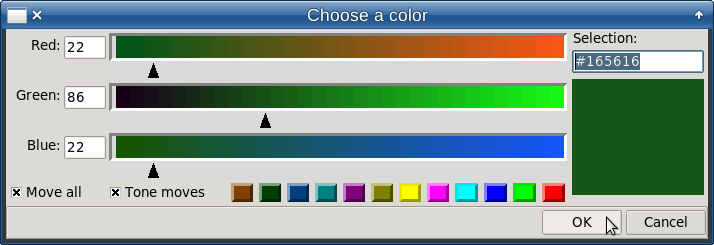
The widget list item for color picker is set as follows:
  {labclr1 - - - - {-st e} {-t "Choose a color............"}}
  {clr1 labclr1 L 1 1 {} {-tvar ::clr1 -showcolor 0 -title {Choose a color}}}
where:
labclr1- a prompt
clr1- an entry to get a color
::clr1- a variable to store the color
-showcolor 0- hides the color box
{Choose a color}- a title of picker dialogThe F2 hotkey is provided to call the picker.
The widget is shown like this:

and runs in Linux the following dialogue:
See also the description of the picker.
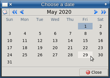
Date Picker
The widget list item for date picker is set as follows:
  {labdat1 - - - - {-st e} {-t "Choose a date............."}}
  {dat1 labdat1 L 1 9 {} {-tvar ::dat1 -title {Choose a date} -dateformat %d.%m.%Y}}
where:
labdat1- a prompt
dat1- an entry to get a date
::dat1- a variable to store the date
{Choose a date}- a title of picker dialog
%Y.%m.%d- a date formatThe F2 hotkey is provided to call the picker.
The widget is shown like this:

and runs the following dialogue:
This dialogue can be run independently, with a command like this:
  set res [::apave::obj chooser dateChooser datevar -parent $win -dateformat %D]

  where:
  datevar - variable name to set a date
  win - parent window (to center the date picker inside it)
  res - gets a date chosen or {}
See also Reference of klnd package.
Calendar
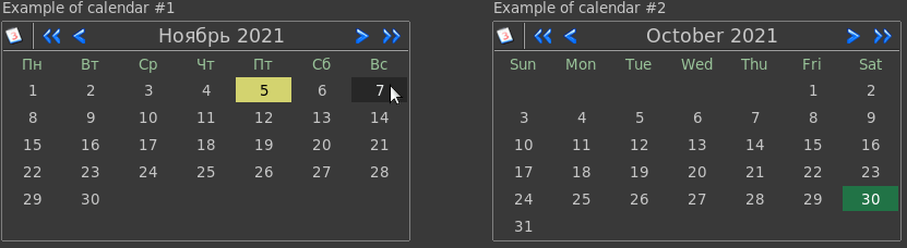
The widget list item for calendar is set as follows:
{lab - - 1 1 {-st nswe} {-t {Calendar:}}}
{daT lab T 1 1 {-st nw} {-relief raised -tvar ::dateKlnd
-dateformat $::formatKlnd -com {puts date1=$::dateKlnd} -locale en_us}}
where:
lab- a label
daT- a frame containing the calendar
::dateKlnd- a variable to store the date
::formatKlnd- a variable (optional) containing a date format
-com {...}- a command (optional) executing at clicking a day in the calendar
-locale en_us- a locale (optional), here en_us sets "Sun Mon Tue..." week days instead of "Mon Tue Wed..."Note: the calendar has
daTtype of widget which differs fromdattype described above.The calendar widgets may be multiple, each one may have independent options, as seen below:
Other details are available in Reference of klnd package.
Menubar
The widget list item for menubar is set as follows:
  {Menu - - - - - {-array {
  File "&File"
  Edit &Edit
  help "&{Help (wordy)} -state normal -menu .win.menu"
   }}}
where:
Menu- a menubar name
the menubar items are set as-arraypairs of:
menu item's name (File, Edit, help)
menu item's label (File, Edit, {Help (wordy)}and possible attributes (-state, -menu etc.) with appropriate valuesThe widget is shown like this:

Note: a menubar can be defined in any place of widget list because it is assigned to a whole window.
Menu, File and Edit widget names are uppercased, while their full names are: .win.menu, .win.menu.file, .win.menu.edit.
So, if the apave object is pobj, then you can use the [pobj Widget] to get the full widget name, e.g. this way:
  [pobj Menu] entryconfigure 2 -font {-slant roman -size 10}
  [pobj File] entryconfigure 2 -state disabled
Also, for better performance you can fill the menu items after creating the window, using after idle command:
  proc ::NS::fillMenu {} {
  set m [::NS::pobj File]
  $m add command -label "Open..." -command \
    {error "this is just a demo: no action for \"Open...\""}
  $m add command -label "New" -command \
    {error "this is just a demo: no for \"New...\""}
  # ...
  }
  # ...
  pobj paveWindow .win.fra {
  # ...
  # widget list
  # ...
  }
  after idle [list ::NS::fillMenu]
Toolbar
The widget list item for toolbar is set as follows (taken from test2_pave.tcl of downloaded apave_tests.zip):
  # create images for toolbar
  foreach {i icon} {0 retry 1 add 2 delete 3 undo 4 redo 5 run} {
  image create photo Img$i -data [::apave::iconData $icon]
  }
  # ...
  pobj paveWindow .win.fra {
  {tool - - - - {pack -side top} {-array {
    Img1 {{::t::toolBut 1} -tooltip "Start progress" -state disabled}
    h_ 3
    Img2 {{::t::toolBut 2} -tooltip "Stop progress"}
    sev 7
    h_ 1
    Img5 {{::t::e_menu} -tooltip "Run e_menu"}
    sev 7
    h_ 1
    Img3 {{::t::toolBut 3 \[set ::t::prevcs\]}}
    h_ 1
    opcTool {::t::opcc ::t::opcColors {-width 20} {t::opcToolPre %a} -command t::opcToolPost -tooltip "Current color scheme"}
    h_ 1
    Img4 {{::t::toolBut 4 \[set ::t::nextcs\]}}
    h_ 4
    ChbRestart {-var ::t::restart -t "Restart" -tooltip "To restart test2\nif CS changes"}
    sev 8
    h_ 1
    spX  {-tvar ::t::fontsz -command {::t::toolBut 4 -3} -from 9 -to 12 -w 3 -justify center -tooltip "Font size 9..12" -myown {
      puts "\nA local/global configuration may be set with -myown attribute, e.g.\
        \n  %w configure -bg yellow -font {-weight bold}\
        \n  ::NS::GLOBAL_CONFIG %w"}}
  }}}
  # ...
  }
where:
tool- a toolbar name
-arraypairs containing:
Img1, Img2, Img3, Img4, Img5 - image names
h_, sev - spacers and separators (names need not to be unique), with their appropriate widths
{{::t::toolBut 1} -tooltip "Start progress" -state disabled} - a command to handle clickings and additional attributes of buttonsThe widget is shown like this:

Note: in the toolbar item, the image names are listed, while their appropriate buttons' names have
BuT_prefix and accessible through[pobj BuT_img], this way:[pobj BuT_Img3] configure -state normal
These constructs are used in the appropriate handlers (::t::toolBut in the above example).
Statusbar
The widget list item for statusbar is set by the following template:
  {lfrB.staMain - - - - {pack -side bottom} {-array {
  {Row:       -font {-slant italic -size 10}} 7
  {" Column:" -font {-slant italic -size 10}} 5
  {"" -font {-slant italic -size 10} -anchor w} 40
  }}}
where:
staMain- a statusbar name
-arraypairs containing:
Row:, " Column:", "" - prompts for cells, -font ... -anchor ... - attributes of cells
7, 5, 40 - widths of cellsThe widget is shown like this:

The prompts' names have
Lab_prefix before the parent statusbar name, and index as suffix.
The cells' names haveLabprefix before the parent statusbar name, and index as suffix.
So, you can use them in appropriate handlers this way:[pobj LabstaMain_1] configure -text "Height:" [pobj LabstaMain_2] configure -text " Width:" [pobj LabstaMain1] configure -text "100" [pobj LabstaMain2] configure -text "200" [pobj LabstaMain3] configure -text "3d cell's content"
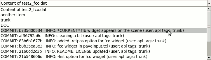
File Content Combobox
The file content combobox presents text file(s) content. The appropriate widget list item is set by the following template:
  {fcoMain - - - - {pack} {-tvar ::fcoVar -w 88 -values {
  TEXT1
  @@-div1 \" (\" -div2 ) -ret true test1.txt@@
  TEXT2
  @@-pos 0 -len 7 -list {a b c} test2.txt@@
  ...
  TEXTN
  }}}
where:
fcoMain- a widget name
-tvar ::fcoVar- sets a variable for store a result
TEXT1, TEXT2, ... TEXTN- optional texts outside of @@...@@ data sets
@@ ... @@- data set for a file, containing the file name and (optionally) its preceding options:
-div1, -div2 - dividers to cut substrings from file lines:
if -div1 omitted, from the beginning; if -div2 omitted, to the end of line
-pos, -len - position and length of substring to cut:
if -pos omitted, -len characters from the beginning; if -len omitted, to the end of line
-list - a list of items to put directly into the combobox
-ret - if set to true, means that the field is returned instead of full stringIf there is only a single data set and no TEXT, the @@ marks may be omitted.
The
regexpconditions may be used to filter lines. For example:@@-RE {^(\s*)([^#]+)$} ./test2_pave.tcl@@- this data set would deliver non-commented lines of ./test2_pave.tcl only. If-REresult is empty, the whole fco line is skipped, not regarding what other data sets result in.The @@ edging marks may be configured with the configure method:
pobj configure edge "@|@"
The following example is taken from test2_pave.tcl of downloaded apave_tests.zip:
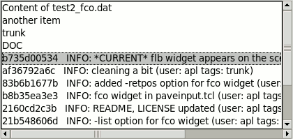
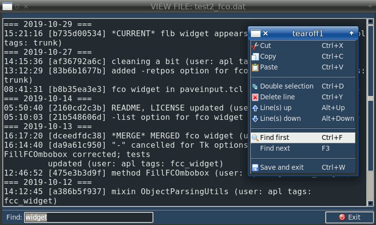
  {fco - - - - {pack} {-tvar t::cb3 -w 88 -values {COMMIT: @@
  -div1 " \[" -div2 "\] " -ret true test2_fco.dat @@   INFO: @@
  -pos 22 -list {{Content of test2_fco.dat} {another item} trunk DOC}
  test2_fco.dat@@
  }}}
The widget is shown like this:
File Content Listbox
The file content listbox presents text file(s) content. Its widget list item is the same as for file content combobox, with the only difference:
-lvar attribute sets a variable name for storing a result.The following example is taken from test2_pave.tcl of downloaded apave_tests.zip:
  {flb - - - - {pack -side left -fill x -expand 1}
  {-lvar ::t::lv1 -w 50 -values
  {@@-div1 " \[" -div2 "\] " test2_fco.dat@@   INFO: @@
  -pos 22 -ret 1 -list {{Content of test2_fco.dat} {another item} trunk DOC}
  test2_fco.dat@@
  }}}
The widget is shown like this:
File Content Viewer/Editor
The file content viewer/editor presents text file(s) content.
The following example is taken from test2_pave.tcl of downloaded apave_tests.zip:
  {
  ftxMain labBftx1 L 1 9 {} {
  -h 7 -ro 0 -tvar ::t::ftx1 -title {Pick a file to view}
  -filetypes {{{Tcl scripts} .tcl} {{Text files} {.txt .test}}}
  -wrap word}
  }
where:
ftxMain- a widget name
-ro 0- set readonly to false (making the text changeable)
-tvar- sets a variable containing a file name (::t::ftx1)
-filetypes- sets a list of file types for file pickerThe file name and the text may be changed by this widget, so that you can get both of them in an appropriate callback command:
  set file_name $::t::ftx1
  set text_content [::pobj getTextContent ::t::ftx1]
The F2 hotkey is provided to call the file picker.
The widget is shown like this:
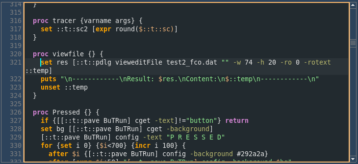
Also apave allows to call a text viewer/editor as a stand-alone dialog, by use of:
  set res [pdlg vieweditFile mytext.txt "" -w 80 -h 24 -rotext ::temp]
  puts "Result: $res. Content of text:\n$::temp"
  unset ::temp
where:
pdlg- a apave object (of APave class)
mytext.txt- a file name
""- stands for prepost command which is performed before opening and before closing the dialog
-rotext- sets a temporary variable to hold the file content (::temp); also, if -rotext is set, there is no "\\n -> \n" conversion for a textBy default
vieweditFilemethod works in view mode, but you can set edit mode by use of -readonly false (-ro false) argument.Note: you can only add -w, -h, -readonly, -ro, -rotext, -pos, -centerme, -myown or font attributes, no other attributes are permitted:
set res [pdlg vieweditFile $filename "" -w 80 -h 20 -rotext ::temp -ro 0 -pos 10.0 -centerme .win -myown {puts %w} -weight bold]The optional prepost command is useful when you need some actions to be performed on the text without its reading/writing. The widget itself reads and writes the text, so it can provide its contents to pre/post-process at the reading/writing.
Also, at the pre-processing you can add your own attributes for the text, depending on its contents. For testing, try
-myown {puts %w}.The prepost command should be declared as follows:
proc ::NS::prepost_edit {dataName {wtxt ""}} {
  upvar 1 $dataName data
  # ... code ...
  if {$wtxt eq ""} {
  # it's PRE code ...
  } else {
  # it's POST code ...
  }
}
where:
dataName- a variable name for a contents of text widget
wtxt- a name of text widget The 'pre-processing' code serves to prepare the initial contents of the text widget. This code returns a string containing additional attributes for a text widget, e.g. "-pos nl.nc" for a cursor position.The 'post-processing' code serves to prepare the final contents of the text widget. It deals with
wtextwidget's path to access its contents.The prepost command is used in e_menu utility to edit its menus.
The file viewer/editor (taken from test2_pave.tcl of downloaded apave_tests.zip, with -readonly false) is shown like this:
Option Cascade
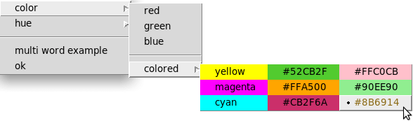
The option cascade (opc) widget has originated from tk_optionCascade widget made by Richard Suchenwirth. The link is good to follow before using the widget.
The apave uses a bit modified version of original tk_optionCascade widget.
The following example is taken from test2_pave.tcl of downloaded apave_tests.zip:
  set ::t::opcItems [list {{Color list} red green blue -- {colored yellow magenta cyan
  | #52CB2F #FFA500 #CB2F6A | #FFC0CB #90EE90 #8B6914}} \
  {hue dark medium light} -- {{multi word example}} ok]
  ...
  {.lab1 - - - - {-st e} {-t " 1st way, good:"}}
  {.Opc1 frAopc.lab1 L 1 1 {-st w} {::t::opcvar ::t::opcItems {-width -4} \
    {t::opcPre %a} -command t::opcPost }}
  ...
The widget is shown like this:
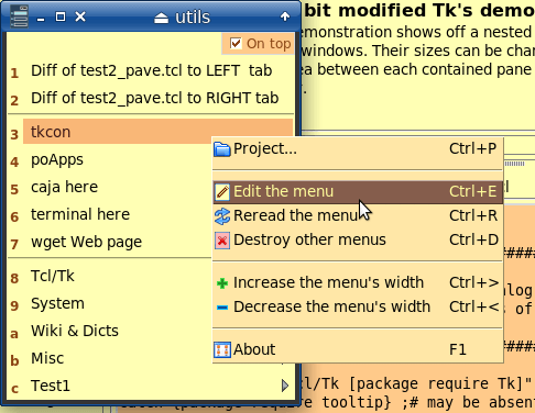
The e_menu Widget
The e_menu widget has originated from e_menu utility. This pair, apave and e_menu, has influenced each other a lot. Like Tcl and Tk :)
The e_menu widget creates a stand-alone menu system containing any external commands to be executed in the OS environment, using any arguments which a caller program would like to process.
To include e_menu widget into your Tcl code, use the following syntax:
set emdir "some-location-of-e_menu-utility"
source [file join $::emdir e_menu.tcl]
# ...
::em::main -prior 1 -modal 1 -remain 1 {*}$e_menu_args
where:
-prior- a boolean option that means "use previous (if any) settings"; it's useful at repeated calls of e_menu widget to restore a color scheme etc.; default is0
-modal- a boolean option that means "open e_menu as a modal window"; default is0
-remain- a boolean option that means "do not close menus until a manual closing"; any commands/menus of RE/SE/ME type would not close a current e_menu's window so that it would stay on the screen; default is0
e_menu_args- arguments of e_menu utilityThe widget is shown like this:
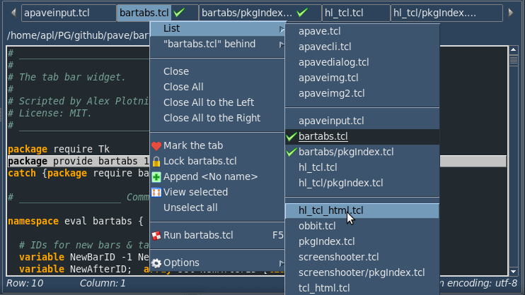
Bar of Tabs
The bartabs is a tab bar widget with a lot of options and its own detailed documentation and reference.
The following example is taken from test2_pave.tcl of downloaded apave_tests.zip:
{.lfrB.BtsBar - - - - {pack -side top -fill x} {::t::fillBarTabs %w}}which means that::t::fillBarTabsprocedure will be given a parent window's full path (.lfrB.btsBar being its tail) instead of %w. This procedure will create and show the tab bar inside the passed .lfrB.btsBar.The widget is shown like this:
Link
The link can be made from a ttk::label (lab) or text (tex) widget.
The following example is taken from test2_pave.tcl of downloaded apave_tests.zip:
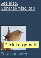
{LabImg fraflb T 1 1 {} {-link "::t::goWiki@@Click to go wiki@@"}}
{LabImgInfo LabImg T 1 1 {} {-link "
::t::chanTab nbk .win.fra.fra.nbk.f4; focus [::t::pave SpxMisc]@@Click to select 'Misc.'\n... and paint the link\n(to test the multiple visited links).@@" -afteridle ::t::labelImaged}}

#...
proc ::t::labelImaged {} {
  pave labelFlashing [pave LabImg] [pave LabImgInfo] 1 \
  -file {1-small.png 2-small.png 3-small.png 4-small.png} \
  -label {"Cisticola exilis" "Titmouse" "Wheatear" "Eurasian wren"}
}
The -link data contains the following parts separated with @@:command(s)- command(s) to be executed at clicking the linktooltip- a hint on the command(s)0/1- a flag "the link visited"The link may consist of two ttk::label - the first is an image, the second is a text. At that the second can be supplied with -afteridle option meaning a command to be executed for binding the two links together.
This -afteridle command (here
::t::labelImaged) calls the pave method namedlabelFlashingand passes it the following arguments:- image label's path
- text label's path
- 1 as a flag of first run
- -file (or -data) option listing the image files/data for the image label
- -label option listing the texts for the text label
The
labelFlashingcan take also the following options:-incr 0.01- the increment of opacity will be 0.01-after 10- the opacity will be incremented at 10 milliseconds interval-pause 3.0- the pause at the 1.0 opacity will be 3 seconds-squeeze 9- the image will be squeezed by 9 factor-static 1- there will be no transition effectsThe link for ttk::label is shown like this:
To get the links in the text widget, the apave displayTaggedText method and apave dialogues are used. The displayTaggedText method takes tags argument for <link*> </link*> tags which contain the link data as described above. The apave dialogues take -tags option meaning the tags' list.
The tag list can include "FG", "FG2", "BG" and "BG2" tags meaning the fb/bg colors of links (default and hovered, accordingly), e.g. to invert the default/hovering colors:
  set ::t::textTags [list [list "linkVis" "::t::browser %t@@https://%l@@1"]]
  lassign [apave::obj csGet] fg fg2 bg bg2
  lappend textTags "FG $fg2" "FG2 $fg" "BG $bg2" "BG2 $bg"
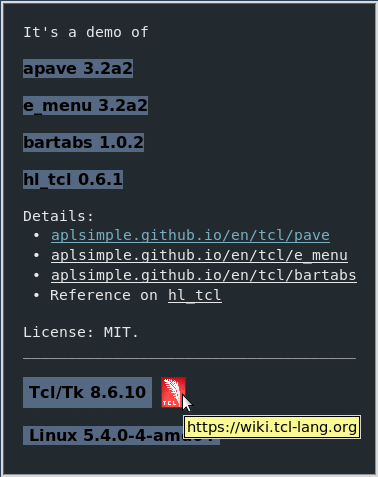
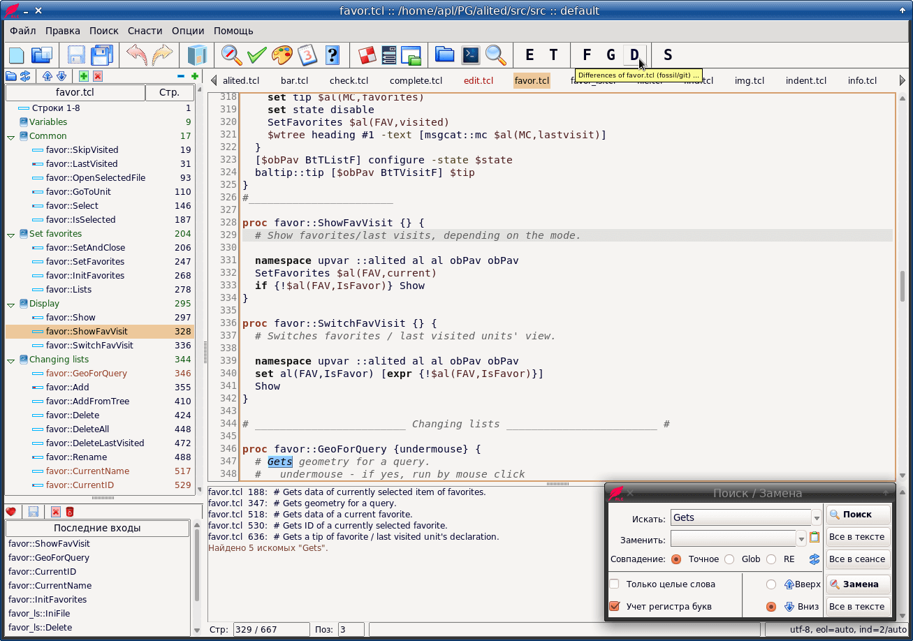
Below is a bit modified snippet from test2_pave.tcl of downloaded apave_tests.zip:
set ::t::textTags [list \
  [list "linkVis" "::t::browser %t@@https://%l@@1"] \
  [list "link1" "::t::browser %t@@https://%l@@"] \
  [list "link2" "::t::browser %t@@https://aplsimple.github.io/en/tcl/%l/%l.html@@"] \
  [list "link3" "::t::browser %t@@https://wiki.tcl-lang.org@@"]]
:t::msg info "  Details:
   \u2022 <linkVis>aplsimple.github.io/en/tcl/pave</linkVis>
   \u2022 <link1>aplsimple.github.io/en/tcl/e_menu</link1>
   \u2022 <link1>aplsimple.github.io/en/tcl/bartabs</link1>
   \u2022 Reference on <link2>hl_tcl</link2>

  License: MIT.
  _____________________________________

   $::tcltk_version  <link3></link3>" \
  -t 1 -w 41 -scroll 0 -tags ::t::textTags -my "after idle {::t::showLogo %w}"

proc ::t::showLogo {w} {
  pave labelFlashing [pave textLink $w 4] "" 1 \
  -file feather.png -pause 0.5 -incr 0.015 -after 20
}
The links for text are shown like this:
Gutter
The gut widget provides a gutter of line numbers for a text widget.
Normally, the gutter is positioned at the left side of the text.
In apave layout, these two widget are neighbors:
  {.lfrB.GutText1 .lfrB.stat T - - {pack -side left -expand 0 -fill both} {}}
  {.lfrB.Text1 .lfrB.canLines T - - {pack -side left -expand 1 -fill both} {-gutter GutText1 -gutterwidth 5 -guttershift 4 -w 80 -h 10 -wrap word}}
  {.lfrB.sbv .lfrB.text L - - {pack -side top}}
In this code snippet, the gutter (GutText1) and the text (Text1) are linked through
-gutteroption of the text widget.Note that the gutter (GutText1) is declared by its uppercased name, so the text can refer to it by this short name. Another way is using the gutter's path fully qualified, e.g.
-gutter .win.fra.fra.nbk.f2.fra.pan.panR.lfrB.gutText1. It's a good example how apave can facilitate the GUI layout.The
-gutterwidthoption sets the gutter's width in characters: "5" means that the text would have maximum 99999 lines. The-guttershiftoption sets the width of the separator between the gutter and the text.The gutter widget and the linked text are shown like this:
Scrolled Frame
The scf widget provides a scrolled frame. It's made by Paul Walton.
The widget has -mode option with values:
- "both", "xy", "yx" all mean that both scrollbars are visible
- "x" means that a horizontal scrollbar is visible only
- "y" means that a vertical scrollbar is visible only
A typical usage of scf widget includes a wrapping frame with
{-st nsew -cw 1 -rw 1}options:{v_ - - 1 1} {fra v_ T 1 1 {-st nsew -cw 1 -rw 1}} {fra.scf - - 1 1 {pack -fill both -expand 1} {-mode y}} {.labU - - 1 1 {-st w -pady 1 -padx 3} {-t "User name:"}} {.entU .labU L 1 1 {-st sw -pady 5} {-tvar alited::al(TPL,%U) -w 40}}The scrolled frame widget (containing labels and comboboxes) is shown like this:
Switch
The swi widget provides a switch. This widget is the same as ttk::checkbutton, just having a different appearance. It is well fit to sequential rows of label-switch options.
Note: the switch can be only used with azure, forest and sun-valley themes. With other themes it runs as ttk::checkbutton.
The alited editor uses switches in "Preferences" dialogue. You can download its code to access the azure, forest and sun-valley themes (dark and light), with examples of usage (ini.tcl).
The switch widget is shown like this:
User widgets
It's possible to create and register a user's widget, by means of
::apave::defaultAttrsprocedure. This procedure can be also used to get or change options and attributes of registered widgets.The
::apave::defaultAttrsis declared as follows:proc defaultAttrs {{type ""} {opts ""} {attrs ""} {widget ""}} { # Sets, gets or registers default options and attributes for widget type. # type - widget type # opts - new default grid/pack options # attrs - new default attributes # widget - Tcl/Tk command for the new registered widget typeThe
typeshould be a three letter unique string.If the
typeis absent in the registered types andoptsand/orattrsis not set to "", defaultAttrs registers the newtypewith its grid/pack options and attributes. At thatwidgetis a command for the new widget type.Options and attributes may contain data (variables and commands) to be processed by [subst].
The
::apave::defaultAttrsreturns:- if not set
type: a full list of options and attributes of all types - if set
typeonly: a list of options, attributes and widget - else: a list of updated options, attributes and widget
The best example of its usage is provided by
::apave::ttkToolbuttonprocedure:ttk::style map Toolbutton {*}[dict replace [ttk::style map Toolbutton] \ -foreground "pressed $fg1 active $fg1" -background "pressed $bg1 active $bg1"] defaultAttrs btt {} {-style Toolbutton -compound top -takefocus 0} ttk::button defaultAttrs brt {} {-style Toolbutton -compound right -takefocus 0} ttk::button defaultAttrs blt {} {-style Toolbutton -compound left -takefocus 0} ttk::buttonThe
::apave::ttkToolbuttonprocedure may be called to usebtt, brt, bltbuttons in a user defined toolbar (instead of apave's toolbar), or to use the buttons independently as it's done in test2_pave.tcl of downloaded apave_tests.zip.
Mega-Attributes
Some widget attributes are specific to apave.
Attribute Description -title {title} for fil*, fis*, dir*, fon*, clr*, dat*, ftx* mega-widgets -dateformat format for the date chooser & calendar -array {imagename {"command"} ...} for the toolbar -array {{"prompt"} width ...} for the statusbar -readonly 1 for the text widget: sets a readonly mode -rotext varname sets a variable to hold the text widget content (varname); sets the text widget readonly if there is no "-readonly 0" -tags list sets a list of tags for readonly text widget & dialogue -tabnext widgpath sets a next widget to be focused by Tab key (btw., disabling tabs for a text widget) -cbxsel "value" for the combobox and file combobox widgets: sets a selection to a line beginning with "value" -lbxsel "value" for the listbox, file listbox and tablelist widgets: sets a selection to a line beginning with "value" -tooltip "tip message"
-tip "tip message"sets tips for most of widgets and can be of the form: -tip {-BALTIP {This is exposed 1 time} -MAXEXP 1}
where -MAXEXP is an option of baltip package;
there may be other options included-traverse true means that the notebook is traversed (due to ttk::notebook::enableTraversal) -propagate 0 executes grid propagate $w 0 (or pack propagate $w 0) for a current widget -selected 1 executes $w selection range 0 end for a current widget -select tab means that the tab of the notebook will be selected at opening -ALL true makes "lbx", "cbx", "flb", "fco" and "tbl" widgets return a full result, i.e. the current selection and contents of the widget;
it's useful for changeable widgets-link linkdata means that the ttk::label will be linked to a command similar to WWW link (see below on the linkdata) -gutter GutText means that a text widget will have a gutter of line numbers (see below on the gutter) -afteridle {command %w} means a command to be run as "after idle" argument when the window paving done;
%w is a full path to a widget with this attribute-bartabs {command %w} means a command filling a bar of tabs, to be run when the window paving done;
%w is a full path to a widget with this attribute-timeout seconds makes a timeout to be counted down before executing a button's command -columnoptions {column {option value...} ...} sets a list of options for treeview (tre) columns -selcombobox {command} sets a command executed at selecting a combobox item -selborderwidth value sets a border for text widget's selection -popup {command} defines a command called at right-clicking a widget (redefining other possible popups) -method true forces making "WidgetName" method from "widgetName"; the method returns a widget's full path -debug true puts out a widget's full path and (if exists) its method -myown {command %w} sets a command to be run after a creation of widget;
%w is a full path to a widget with this attributeThe last
-myown {command %w}attribute is most interesting. The%wcorresponds to the widget's path. Thecommandmay be set directly, like this:-myown {%w configure -bg yellow -font {-weight bold}}Or the
-myowncommand(s) may be defined globally to apply to all appropriate widgets:-myown {::NS::ATTR_THIS %w} -myown {::NS::ATTR_THAT %w}so that they might be identified and named as "my own" attributes.See also:
Option Abbreviations
Options of APave dialogues
Option Abbreviations
The apave provides the option abbreviations to save the keypressing. Naturally, you can use the full option names as well.
However, as for apave, you may use the abbreviations:Abbreviation Option / Command -st -sticky -com -command -t -text -w -width -h -height -var -variable -tvar -textvariable -lvar -listvariable -rw $val grid rowconfigure -weight $val -cw $val grid columnconfigure -weight $val -rsz $val grid rowconfigure -minsize $val -csz $val grid columnconfigure -minsize $val
APave Methods
Assuming
pobjis a APave object, the pobj methods are described below.1. pobj makeWindow is to make the window. This method is useful to define and to configure some specific widgets prior their laying out. The calling format:
pobj makeWindow win ttl

where:

  win is the window pathname
  ttl is the window's title
For example:
pobj makeWindow .win "Hello world!"2. pobj paveWindow is to lay out the window. The calling format:
pobj paveWindow win lwidg

where:

  win    is the window pathname
  lwidg  is the list of widgets' options
For example:
pobj paveWindow .win {
{lab1 - - 1 1 {-st es} {-t "Find: "}}
{ent1 lab1 L 1 9 {-st wes} {-tvar ::en1}}
{lab2 lab1 T 1 1 {-st es} {-t "Replace: "}}
{ent2 lab2 L 1 9 {-st wes} {-tvar ::en2}}
}3. pobj res is to get/set a result of variable that used for closing the window. The calling format:
pobj res win ?val?

where:

  win is the window pathname
  val is the value of variable for closing the window
       (if "val" omitted, "pobj res" returns the variable value)
For example:
pobj res .win 0
...
pobj res .win 1
...
set res [pobj res .win]4. pobj displayTaggedText is to display the tagged text in the text widget. The calling format:
pobj displayTaggedText txtWidg txtName txtTags

where:

  txtWidg is the text widget pathname
  txtName is the name of variable containing the text
  txtTags is the list of tags
For example:
set textTags [list \
[list "b" "-font {-weight bold -size 14}"] \
[list "i" "-font {-slant italic -size 14}"]]
set contents "<i><b>Hello world!</b></i>"
pobj displayTaggedText .win.texD contents $textTagsThere are also other procedures and methods. Refer to ::apave reference for details.
showModal method
showModal is the main method to show a toplevel window. The calling format:
pobj showModal win args

where:

  win  - the window pathname
  args - the optional arguments
The optional arguments are set as
-option valuepairs. The options are listed below:Option Description -modal sets the window as modal/not modal (true by default) -root a parent window's path -decor if true, cancels making the window transient with wm transient $win $root-container a transient parent's path to make the window transient with wm transient $win $container-ontop if true, sets the window as topmost above others -focus sets a widget to be focused at opening the window;
it can be set as a glob pattern, e.g.-focus *.ent1-geometry sets a geometry of the window, as "WxH+X+Y", "+X+Y" or "pointer+X+Y";
the "pointer+X+Y" means that the window will be shown at the mouse pointer;
for negative shifts (to left/up), it's set as "pointer+-X+-Y"-centerme if it's a window's path, the window is centered over it;
if it has "WxH+X+Y" form, the window is centered over this rectangle-checkgeometry if true (default), checks and corrects the window's coordinates against the screen -resizable is a flag or a list of "flagX flagY" to allow resizing the window by X and/or Y -onclose sets a command to be executed on [X] clicking;
if this option is set as-onclose destroy, the window will be destroyed-escape if true (default), binds Escape key to close the window -variable sets a variable name for tkwait (by default, showModal uses its own variable) -waitvar if false, skips tkwait variable varnamefor a non-modal window,
so that showModal returns immediately after showing the window;
by default, showModal waits for closing the window-waitme The -waitme option can hide the process of populating a complex window before showing it
(e.g. showing a progress bar only), instead of showing the process step by step.
If the option is empty, the window is deiconified immediately beforetkwaitcycle,
otherwise after waiting a variable or "timeout and/or idle", e.g.:-waitme ::var_to_wait ;# deiconified after changing the variable -waitme 1000 ;# deiconified after 1 second -waitme idle ;# deiconified after idle -waitme {idle after 1000} ;# deiconified after idle and 1 secondIf a variable is used as -waitme value, it is supposed to be integer:
after deiconifying, it's incremented so that other bound events can be triggered.For
-focus -onclose -geometry -decor -root -resizable -ontop -escape -checkgeometryoptions, it's possible to reset their default values by means ofsetShowOptionmethod, this way:pobj setShowOption -escape 0 pobj setShowOption -resizable 1
An example of calling showModal:
proc ::doClose {varName} {
  # varName is the name of variable that can be changed to 0 (1) in order to close the window.
  # This value is returned by pobj showModal.
  if {[tk_messageBox -type yesno -message "Quit?"] eq {yes}} {
    set $varName 0
  }
}
...
pobj showModal .win -focus *.ent1 -geometry +200+100 -onclose ::doClose
Note: by default, showModal doesn't destroy the window. You have to do it yourself with a command
destroy $win.
Also note that -onclose ::doClose is a must if you want to control clicking [X] button or pressing Alt+F4; at that ::doClose procedure must have an argument meaning a variable name for tkwait: it should be changed somehow by ::doClose to a value (e.g. 0) which will be a result of showModal. Or given a response from a user, you don't change the variable so that the window remains open.
Theming of APave
The theming facility is enabled with procedures and methods as follows.
1.
apave::initWM- a procedure that initializes a work with a window manager. Theapave::initWMis good to be called at starting an application, because it ensures a correct work of apave.Syntax:
  apave::initWM ?-option value...?

  where -option may be:
  -theme        - ttk theme (default, clam, alt etc.)
  -cs           - color scheme
  -cursorwidth  - cursor width
  -buttonwidth  - button width
  -buttonborder - button border
  -labelborder  - label border
  -padding      - padding for buttons and labels
2. The csSet method of object allows to set a
cscolor scheme for all widgets of a window and its descendants.Syntax:
  pobj csSet cs win

  where:
  cs - index of a color scheme
  win - window's path ("." if omitted)
3. The csToned makes a new color scheme that has tones (hues) of a
cscolor scheme. Then the colors of the new CS are applied to all widgets.Syntax:
  pobj csToned cs hue

  where:
  cs - index of a color scheme
  hue - value of hue (-99 through 99, from dark to light)
4. The APave constructor of object allows to set a (otherwise optional)
cscolor scheme. The APave constructor has "win" and "cs" arguments.Syntax:
APave create pobj $win $cs
The color schemes (CS) are indexed from -2 to 47. The -2 means "no CS". The -1 through 22 are light CS. The 23 through 47 are dark CS.
The
-1CS is very similar to the default Tk theme. Thus it isn't so much of theme and as such called "basic". Other CSs have their own names too.You can change CSs in a session. However, the best appearance would be achieved when you set CS in the beginning and never change it afterwards in the current session. If a CS should be changed, save it in a config file and restart your application with the new CS.
Though each CS has its own pluses and minuses, CSs of APave are rather numerous and might satisfy most of tastes.
The full list of CSs is best viewed in test2_pave.tcl of downloaded apave_tests.zip.
5. If no APave CS can satisfy your taste, you can provide your own CS for APave.
For this, the
themeWindowmethod is used. Syntax:pobj themeWindow win fg1 bg1 fg2 bg2 fgS bgS fgD bgD cur bclr hlp fgI bgI fgM bgM isCS args
where:
win - window's name
fg1 - foreground for themed widgets (main stock)
bg1 - background for themed widgets (main stock)
fg2 - foreground for themed widgets (enter data stock)
bg2 - background for themed widgets (enter data stock)
fgS - foreground for selection
bgS - background for selection
fgD - foreground for disabled themed widgets
bgD - background for disabled themed widgets
cur - insertion cursor color
bclr - hotkey/border color
hlp - help color (for external use)
fgI - foreground (for external use)
bgI - background (for external use)
fgM - foreground for menus
bgM - background for menus
isCS - use "false" for it, as "true" means that the colors are taken from a APave CS
args - optional argumentsThe hlp, fgI, bgI colors might be used in your own application. E.g. e_menu utility employs them as "header foreground" and "menu items' fb/bg".
The args refers to arguments of
ttk::style map. For example,argsmight be equal to"TButton -foreground {focus black} TButton -background {focus white}".A question is when should pobj themeWindow be called? You might consider the following ways:
- If it were called before pobj window, the theming would embrace only ttk widgets.
- If it were called after pobj window, the theming would embrace all widgets including the non-ttk.
- If, just after creating pave object, you call pobj themeWindow with "." as window path, you would provide the theming for all widgets of this pobj each time you would call pobj showModal.
For example:pobj themeWindow . white #364c64 #d2d2d2 #292a2a white #4a6984 grey #364c64 #02ffff #00a0f0 ... pobj showModal .win1 -geometry +300+80 -decor 1 -onclose ::ns::exitWin1 ... pobj showModal .win2 -geometry +400+80 -decor 1 -onclose ::ns::exitWin2 ...
6. If you want to get/set a default font size for your widgets, you can use the
basicFontSizemethod. Syntax:set fs [pobj basicFontSize] ;# to get a current font size pobj basicFontSize $fs ;# to set a new font size
For the best appearance, it's recommended to call this method at starting your application.
You need not even create a APave object for this. Use
apave::paveObjprocedure to call any APave method:set fs [apave::paveObj basicFontSize] ;# to get a current font size apave::paveObj basicFontSize $fs ;# to set a new font size
7. There are also other procedures and methods of APave theming. They are described in ::apave reference.
More Examples of APave
The picture below is the screenshot of TKE Editor plugin named "Adding Shortcuts".
This dialog was being made (as usual) in several steps. At that, each modification had to be supposedly more complex than previous one.
However, in practice all of them were rather of the same difficulty level due to the simple and clear tool.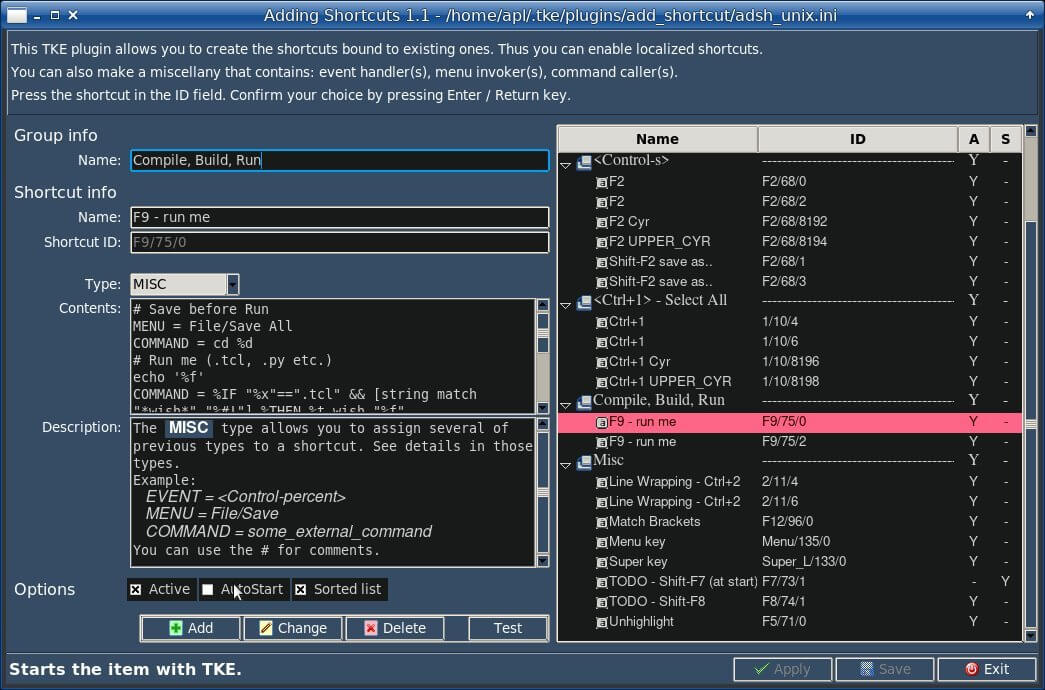
The layout of this dialog is set by the code below. Run the code with wish and press Exit to exit.
The code works as a pure form. So it has no contents and its event handlers are actually handling the errors.
package require apave
set win .win
apave::APave create pdlg
pdlg makeWindow $win "Adding Shortcuts"
set fontbold "-font \"-weight bold\""
pdlg paveWindow $win {
  {frAU - - 1 6   {-st new} {-relief groove -borderwidth 1}}
  {frAU.v_00 - - 1 1}
  {frAU.laB0 frAU.v_00 T 1 1 {} {-t "This TKE plugin allows you to create the shortcuts bound to existing ones. Thus you can enable localized shortcuts."}}
  {frAU.laB1 frAU.laB0 T 1 1 {} {-t "You can also make a miscellany that contains: event handler(s), menu invoker(s), command caller(s)."}}
  {frAU.laB2 frAU.laB1 T 1 1 {} {-t "Press the shortcut in the ID field. Confirm your choice by pressing Enter / Return key."}}
  {frAU.v_0 frAU.laB2 T 1 1}
  {v_0 frAU T 1 6}
  {laB1 v_0 T 1 2 {} {-t " Group info " $fontbold}}
  {laB2 laB1 T 1 1 {-st e} {-t "Name:"}}
  {entOrig laB2 L 1 1 {-st we -padx 5 -cw 3} {-tvar adsh__No}}
  {v_1 laB2 T 1 2}
  {laB3 v_1 T 1 1 {} {-t " Shortcut info " $fontbold}}
  {laB4 laB3 T 1 1 {-st e} {-t "Name:"}}
  {entName laB4 L 1 1 {-st we -padx 5} {-tvar adsh__Na}}
  {laB5 laB4 T 1 1 {-st e} {-t "Shortcut ID:"}}
  {entID laB5 L 1 1 {-st we -padx 5} {-tvar adsh__ID -state readonly}}
  {v_2 laB5 T 1 1 {-pady 8}}
  {laB12 v_2 T 1 1 {-st e} {-t "Type:"}}
  {cbxTyp laB12 L 1 1 {-st w -padx 5 -cw 3} {-tvar adsh__Typ -width 10 -values {MENU EVENT COMMAND} -state readonly}}
  {laB52 laB12 T 1 1 {-st en -rw 1} {-t "Contents:"}}
  {fraComm laB52 L 1 1 {-st nswe -padx 5} {}}
  {texComm - - 1 1 {pack -side left -expand 1 -fill both -in $win.fraComm} {-h 6 -w 50 -fg black -bg white -wrap word}}
  {sbvComm texComm L 1 1 {pack -in $win.fraComm}}
  {laB53 laB52 T 1 1 {-st en -rw 1} {-t "Description:"}}
  {fraDesc laB53 L 1 1 {-st nswe -padx 5} {}}
  {texDesc - - 1 1 {pack -side left -expand 1 -fill both -in $win.fraDesc} {-h 8 -w 50 -state disabled -wrap word}}
  {sbvDesc texDesc L 1 1 {pack -in $win.fraDesc}}
  {v_3 laB53 T 1 2}
  {laBSort v_3 T 1 1 {} {-t " Options " $fontbold}}
  {frAOpt laBSort L 1 1 {-st nsew}}
  {chBActive - - 1 1 {-in $win.frAOpt} {-t " Active " -var adsh__active}}
  {chBAuto chBActive L 1 1 {-in $win.frAOpt} {-t " AutoStart " -var adsh__auto}}
  {chBSort chBAuto L 1 1 {-in $win.frAOpt} {-t " Sorted list " -var adsh__sort -com adsh__sortToggle}}
  {v_4 laBSort T 1 2 {-rsz 10} {}}
  {fra v_4 T 1 2 {-st e -padx 5} {-relief groove -borderwidth 1}}
  {fra.butInsert - - 1 1 {-st w} {-t "Add" -com adsh__addItem}}
  {fra.butChange fra.butInsert L 1 1 {-st w} {-t "Change" -com adsh__changeItem}}
  {fra.butDelete fra.butChange L 1 1 {-st w} {-t "Delete" -com adsh__deleteItem}}
  {fra.h_ fra.butDelete L 1 1 {-padx 10}}
  {fra.butTest fra.h_ L 1 1 {-st w} {-t "Test" -com adsh__testItem}}
  {fraTr laB1 L 14 3 {-st nsew}}
  {tre1 - - 1 1 {pack -side left -in $win.fraTr -expand 1  -fill both} {-columns "ID A S"}}
  {sbv tre1 L 1 1 {pack -in $win.fraTr}}
  {v__u fra T 1 6}
  {seh v__u T 1 6}
  {laBMess seh T 1 2 {} "-foreground white -font \"-weight bold\""}
  {laBh_1 laBMess L 1 1 {-cw 1}}
  {fra2 laBh_1 L}
  {fra2.butApply - - 1 1 {} {-t "Apply" -com "adsh__doApply"}}
  {fra2.butOK fra2.butApply L 1 1 {} {-t "Save" -com "adsh__doSaveExit"}}
  {fra2.butCancel fra2.butOK L 1 1 {} {-t "Exit" -com "exit"}}
}
pdlg showModal $win -focus $win.entOrig -geometry +100+100 -decor 1
In ./tests directory of downloaded apave_tests.zip there are also the following demo tests:test0_pave.tcl- the "Find and Replace" dialog described above.test1_pave.tcl- the "Find and Replace" dialog with "Stay on top" checkbox described above.test2_pave.tcl- a bit more complex dialog "Preferences" with apave being applied to the frames of notebook.test3_pave.tcl- a demo of three windows illistrating how to add a new widget and enlarge an existing widget.
Below a screenshot of test2_pave.tcl of downloaded apave_tests.zip:
... and its themed version:
... and its themed non-ttk widgets:
... and here is a few of its videos:
Probably, the most impressive usage of apave is presented by alited editor. Below are its screenshots of English and localized variants:
... and its themed variant on MS Windows 10: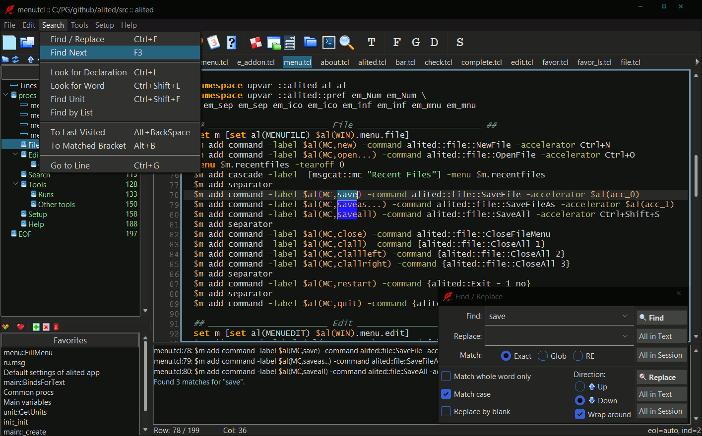
Here is a video, just to glance at it: testing by playtkl package (recording and playback).
Use of APave dialogues
The
APaveoo::class provides a batch of standard dialogues that are enhanced by a checkbox (titled e.g. "Don't show again") and a tagged text option.Also, the
APaveoo::class provides the input facilities. You can call it, e.g., to edit a file or put the data. The plugin applications are most suitable for these facilities as they allow storing the dialogues in the form of data files.Description Calling Screenshot
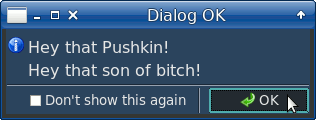
A usual info dialog.
A geometry (+X+Y) and a checkbox (-ch) are set.apave::APave create dlg dlg ok info "Dialog OK" \ "Hey that Pushkin!\nHey that son of bitch!" \ -g +200+200 -ch "Don't show this again"
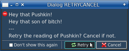
A retrycancel error dialog.
The RETRY argument sets a focused button as the dialog opens.apave::APave create dlg dlg retrycancel err "Dialog RETRYCANCEL" \ "Hey that Pushkin!\nHey that son of bitch! --- Retry the reading of Pushkin? Cancel if not." \ RETRY -g +300+300 -ch "Don't show this again"
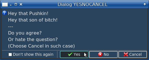
A yesnocancel question dialog.apave::APave create dlg dlg yesnocancel ques "Dialog YESNOCANCEL" \ "Hey that Pushkin!\nHey that son of bitch! --- Do you agree? Or hate the question? (Choose Cancel in such case)" \ YES -g +275+275 -ch "Don't show this again"
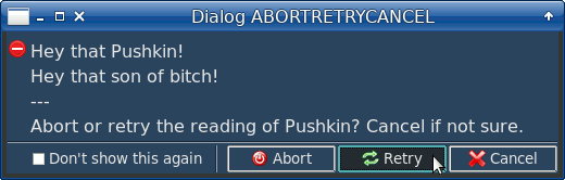
An abortretrycancel error dialog.apave::APave create dlg dlg abortretrycancel err \ "Dialog ABORTRETRYCANCEL" \ "Hey that Pushkin!\nHey that son of bitch! --- Abort or retry the reading of Pushkin? \ Cancel if not sure." RETRY -g +325+325 \ -ch "Don't show this again"
A misc info dialog.
By this dialog you can set as many and as various questions and answers as (reasonably) you want.apave::APave create dlg set retval [dlg misc info "Dialog MSC" \ "\nAsk for HELLO\n" {Hello 1 {Bye baby} 2 \ Misc3 3 Misc4 4 "Misc 5" 5 Cancel 0 } 2]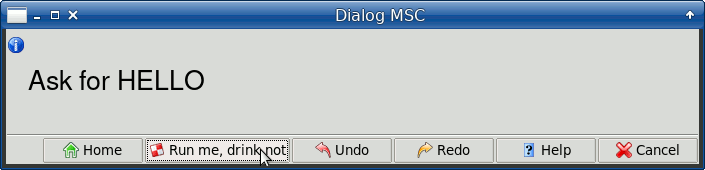
An okcancel editing dialog.
The dialog has a heading that is set as "-head" option.
The icon is set as "" and as such is absent.
The dialog is a small editor. Use Ctrl+F and F3 to find strings.
The return values can include the cursor position used for the next call of this editorling.apave::APave create dlg set textTags [list [list "dark" \ "-foreground black"] \ [list "b" "-font {-weight bold -size 14}"] \ [list "i" "-font {-slant italic -size 14}"]\ [list "red" "-foreground red"]] set res [dlg okcancel "" "Dialog OKCANCEL" \ " <dark>Hey that <red><b> Pushkin </b></red>! Hey that son of bitch! --- Do you agree? <i>Cancel</i> if not.</dark> " TEXT -g +250+250 -text 1 -tags textTags \ -width 30 -height 6 -bg white \ -head "When presented at first\nit's a \ \"changeable text message\"." \ -hsz "12 -slant italic -weight normal" \ -weight bold -size 12 -bg #ffffc4 -ro 0]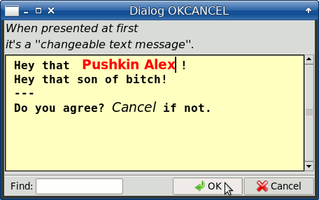
An input dialog.
By this dialog you can get/put the data.
All available widgets are presented in this code sample.
After choosing "OK" the dialog would return the input values as a list.apave::APave create dlg set rellist {- Father Mother Son Daughter \ Brother Sister Uncle Aunt Cousin \ {Big Brother} "Second cousin" "1000th cousin"} lassign "" \ ::ent ::fil ::fis ::dir ::fon ::clr ::dat \ ::chb ::rad ::spx ::lbx ::cbx ::fco ::tex set res [dlg input - "Dialog INPUT" [list \ seh1 {{} {-pady 9}} {} \ ent {{Enter general info........}} "{$::ent}"\ fil {{Choose a file to read.....}} "{$::fil}"\ fis {{Choose a file to save.....}} "{$::fis}"\ dir {{Choose a directory........}} "{$::dir}"\ fon {{Choose a font.............}} "{$::fon}"\ clr {{Choose a color............}} "{$::clr}"\ dat {{Choose a date.............}} "{$::dat}"\ seh2 {{} {-pady 9}} {} \ chb {{Check the demo checkbox...}} $::chb \ rad {{Check the radio button....}} [list \ "$::rad" Giant Big Small "None of these"] \ seh3 {{} {-pady 9}} {} \ spx {{Spinbox from 0 to 99......} {} \ {-from 0 -to 99}} $::spx \ lbx [list {Listbox of relations......} {} \ [list -h 4 -lbxsel $::lbx]] $rellist \ cbx [list {Combobox of relations.....} {} \ [list -h 7 -cbxsel $::cbx]] $rellist \ fco [list {Combobox of file content..} {} \ [list -h 7 -cbxsel $::fco]] { \ @@-div1 " \[" -div2 "\] " -ret 1 \ test2_fco.dat@@ INFO: @@-pos 22 -list \ {test2_fco.dat {other item} trunk DOC} \ test2_fco.dat@@} \ seh4 {{} {-pady 9}} {} \ tex {{Text field................} {} \ {-h 4 -w 55}} $::tex \ ] -size 14 -weight bold -head "Entries,\ choosers, switchers, boxes..." {*}$args] lassign [dlg valueInput] \ ::ent ::fil ::fis ::dir ::fon ::clr ::dat \ ::chb ::rad ::spx ::lbx ::cbx ::fco ::tex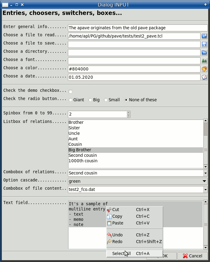
A yesno warning dialog (themed).
The dialog is called in a cycle and breaks it if answered "Yes".
The color (-c) of message is set as Tk standard color ("ghost white").
When the geometry is passed to a dialog, it returns [list answer geometry], so to get its answer thelindexcommand is used.if {[lindex [ \ dlg yesno warn "UFF..." \ "\n Break the dance? \n" \ NO -g +350+350 -weight bold -size 22 \ -c "ghost white" \ ] 0] == 1} break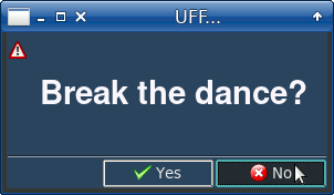
The stanzas on links might be chanted here. Any line (in fact, ttk::label) of dialog's message can be supplied with a link. And any of the text's parts may be tagged with a link. The appropriate code samples can be found in test2_pave.tcl ("Help/About" dialog) and test_pavedialog.tcl ("RetryCancel" dialog) of downloaded apave_tests.zip
Any of dialog buttons (Yes/No/Cancel etc.) may be set as "timeouted", i.e. it may be run after expiring an interval in seconds. See below
-timeoutoption.
Options of APave dialogues
Below is a list of APave dialogue options, with their short / full names. Any option outside the list is considered to be an attribute of the message font.
- -ch / -checkbox value sets a checkbox message
- -g / -geometry +X+Y sets a geometry of dialog
- -c / -color value sets a foreground color for labels
- -H / -head value sets a header
- -t / -text 1 sets a text widget instead of labels
- -tags value sets a tags list for the text message
- -modal 0 shows the dialog as a non-modal window
- -ro / -readonly 0 makes the text editable
- -w / -width value sets a width of text in characters which can be a range {min max}
- -h / -height value sets a height of a text in lines which can be a range {min max}
- -fg value sets a foreground color for text
- -bg value sets a background color for text
- -fgS value sets a selection foreground color for text
- -bgS value sets a selection background color for text
- -hfg value sets a foreground color for header
- -hbg value sets a background color for header
- -hsz value sets a font size color for header
- -cc value sets a cursor color for text
- -pos nl.nc sets a cursor position for text
- -root w sets a root window (to center the dialog)
- -ontop 1 sets the dialog on the top of the screen
-
-timeout {sec wbut} sets a timeout in seconds to invoke wbut button's command; wbut is of ButOK/ButNO/ButCANCEL etc. or "Lab<number>" form, for example
-timeout {3 ButOK}or-timeout {3 Lab1}. - -focus w focuses on a widget at opening the input dialog
- -scroll 0 switches the vertical scroll bar off (for the text dialogues)
- -my / -myown {command %w} sets a command to provide additional attributes
- -help / -help {command %w} sets Help button of a dialogue and a command for it (can be also: -buttons "butHELP {Title} {command}")
-
-buttons / -buttons {but1 ttl1 res1 but2 ttl2 res2 ...} sets triples button & title & result for additional buttons of input dialogue; for example:
-buttons {butChange {Edit it} 3 butUndo {Undo it} 4 butRedo {Redo it} 5}
Input dialog
To call the input dialog, use the following syntax:
  APave create dlg
  set res [dlg input icon title widgets ?dialog options?]
  dlg destroy
where:
The APave input dialog returns a list containing:
- main result (1 for OK, 0 for Cancel)
- others values, depending on a call syntax
To get the variables' values, use valueInput method, this way:
lassign [dlg valueInput] varname1 varname2 varname3 ...
Example:
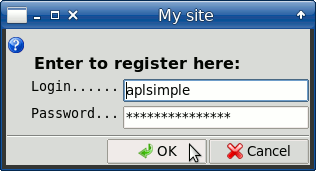
set res [dlg input ques "My site" [list \
  entLogin {{Login......}} aplsimple \
  entPassw {{Password...} {} {-show *}} {} \
] -weight bold -head "\n Enter to register here:"]
if {[lindex $res 0]} {lassign [dlg valueInput] login password}
This code would result in something like:
For a detailed example, see tests/test_pavedialog.tcl of downloaded apave_tests.zip.
The APave class is heavily used in e_menu's dialogues and apavecli.tcl described below.
Use in shell / CLI
This feature is implemented by apavecli.tcl that allows to run apave dialogues from shell / CLI.
As a rule, the apavecli.tcl dialogues contain OK/Cancel (by default) or Yes/No buttons. After choosing OK or Yes, the dialog sets 1 as its result and writes its output to stdout.
The output of apavecli.tcl would be sort of:
#!/bin/bash
export var1='value 1'
export var2='value 2'
...
export varN='value 3'
The output may be redirected to a temporary file. After analizing the result of dialog (1 if OK/Yes, otherwise 0), the temporary file may be sourced to execute the "export ..." commands. So that the dialog's variable values would be assigned to the environment variables within the current shell.
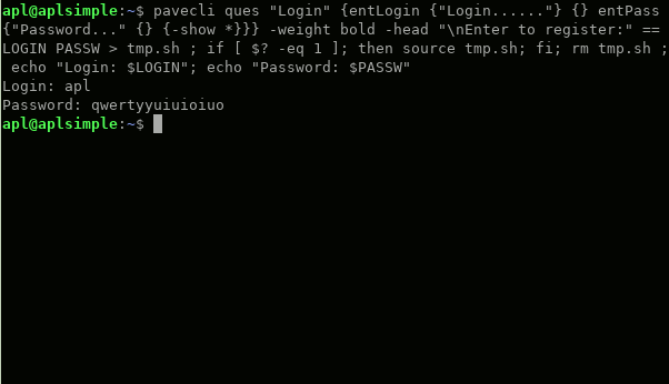
Example:
tclsh ~/UTILS/pave/apavecli.tcl ques "My site" \
  { entLogin {"Login......"} {} \
  entPassw {"Password..."  {} {-show *}} {} \
  } -weight bold -head "\n Enter to register here:" \
  -titleOK "Yes" -titleCANCEL "No" \
  == LOGIN PASSW > tmp.sh
if [ $? -eq 1 ]; then source tmp.sh; fi; rm tmp.sh
echo "Login: $LOGIN"; echo "Password: $PASSW"
The dialog would look like the above shown. That's no wonder, because the same APave input interface is used here.
The
-titleOK "Yes" -titleCANCEL "No"arguments redefine buttons' labels. By default the buttons are labeled OK and Cancel.The
== LOGIN PASSW > tmp.sharguments define LOGIN and PASSW output variables and redirect their assignment to tmp.sh file. After checking the command's result, the tmp.sh file is executed bysource. As a result, LOGIN and PASSW environment variables are set within the current shell. Theechocommand is one of many ways of their usage.Below is the dialog and its CLI command:
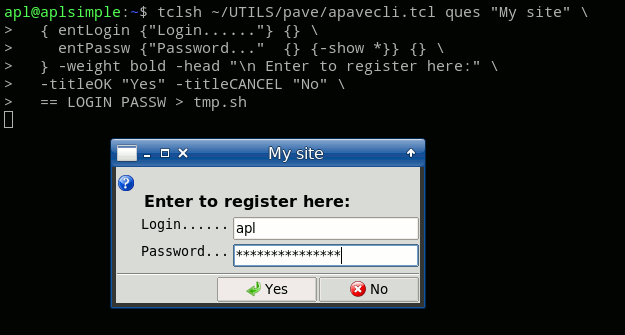
... and the result of echo commands:
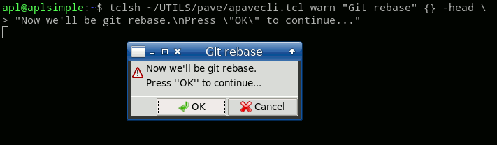
If necessary, the dialog may only contain a message and OK/Cancel buttons, omitting any input:
tclsh ~/UTILS/pave/apavecli.tcl warn "Git rebase" {} -head \
"Now we'll be git rebase.\nPress \"OK\" to continue..."
...as seen below:
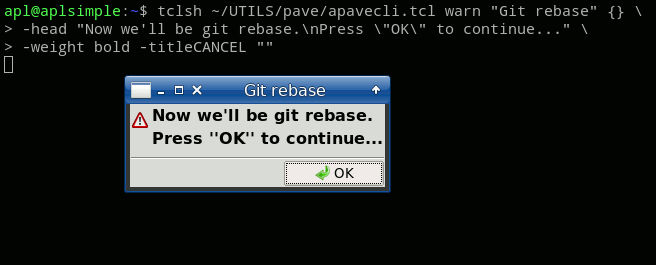
If necessary, the Cancel button may be omitted by use of
-titleCANCEL "":tclsh ~/UTILS/pave/apavecli.tcl warn "Git rebase" {} \ -head "Now we'll be git rebase.\nPress \"OK\" to continue..." \ -weight bold -titleCANCEL ""...as seen below:
See also an example in comments of apavecli.tcl of downloaded apave_tests.zip.
Note: It would be convenient to have a symbolic link to executable apavecli.tcl. Thus, you can use e.g.
apavecliinstead of wordytclsh ~/UTILS/pave/apavecli.tcl.This link should be located on your $PATH and have 'pave' subdirectory under it. Your directory tree may look like this:
 ~/UTILS             (dir on $PATH)
   apavecli           (link)
   pave              (subdir)
   obbit.tcl
   apavedialog.tcl
   ...
   pkgIndex.tcl
Or, to do it simply, you can make an executable apavecli shell script (on $PATH) to call:tclsh ~/SOME/WHERE/pave/apavecli.tcl "$@"
and useapavecli ...instead oftclsh ~/SOME/WHERE/pave/apavecli.tcl .... That's it.
Little things
These tips & tricks are mostly taken from test2_pave.tcl of downloaded apave_tests.zip.
Below,pobjmeans an APave object.
1. A button / label widget with a bound command to fire after a timeout
This feature is available for APave dialogues.
At calling a APave dialogue, you can pass it
-timeoutoption like:-timeout {3 ButOK}for "OK" button to have 3 seconds timeout-timeout {3 Lab1}for a first label to have 3 seconds timeout
For example:
pobj ok info {Button Pressed} {That hurt...} -root .win -head {Ouch! Wow!\nMiau!} -weight bold -timeout {5 Lab1}
2. A progress form for a boot process presumably long
If some GUI application at starting creates a lot of widgets and does other initializations so that this process can take a while, say 4-5-6... seconds, it would be reasonable to run a progress form before calling
paveWindowmethod and other things.The progress form is called this way:
  pobj progress_Begin $type $win $title $topmsg $botmsg $maxvalue -length $length
  ... processing ...
  pobj paveWindow $win \
  ....
  ... processing ...
  pobj progress_End
where:$typeis a type of this progress form (unique sequence of characters)$winis a parent window to center the progress form in$titleis a title of the progress form$topmsgis a top message or {}$botmsgis a bottom message or {}$maxvalueis a maximum value of progress-length $lengthare optional arguments of ttk::progressbar widget (can be continued by others)
Normally,
progress_Beginbegins andprogress_Endends the progress show.In between, to add a progress value, you can use the following:
pobj progress_Go $value $msg1 $msg2
where:$valueis a value to add to the progress$msg1is a top message or {}$msg2is a bottom message or {}
If the
$typeargument ofprogress_Beginis equal to {}, thepaveWindowof APave object participates in the progress too, namely: each widget's creation adds 1 to the progress by callingprogress_Go.Also, if
$typeequals to {}, at ending the progress there will be put out a small statistics of the progress: maximum value, current value, number of steps. It's useful for the customization of$maxvalueargument ofprogress_Begin.See an example in test2_pave.tcl of downloaded apave_tests.zip.
3. Blinking widgets to draw attention
To get a widget blinking, use the following:
::apave::blinkWidget $w $fg $bg $fg2 $bg2 $pause $count
where:$wis a widget's path$fgis a normal foreground color$bgis a normal background color$fg2is a blinking foreground color (if {}, stops the blinking)$bg2is a blinking background color$pauseis a pause in millisec between blinkings$countis a number of blinkings
4. Configurable balloon messages and tooltips
For most widgets, apave provides "-tip" or "-tooltip" attribute processed by baltip package.
Also, you can use the baltip package independently in specific cases, for example to display a balloon message.
Refer to the baltip's Reference for further details.
There is menuTips method allowing to tip a menu, an option cascade and their items, declared as:
method menuTips {win tip {wpar {}}}
#   win - menu's path
#   tip - tip's text
#   wpar - path to menu's parent (for an option cascade)
The tips for menu items are set by
-indexedtips ?idx tip...?.
For example, a tip can be set as:set tip "whole tip -indexedtips 0 firstTip 9 {for tenth item} 11 {tip for #12}"
5. Customized dimensions of Tcl/Tk Unix's file / directory choosers
To set the choosers' geometry (before calling them), use the following:
::apave::setProperty DirFilGeoVars [list dirgeoVar filgeoVar]
where:dirgeoVaris a variable name for directory chooser's geometryfilgeoVaris a variable name for file chooser's geometry
To get the choosers' geometry (after calling them), use the following:
lassign [::apave::getProperty DirFilGeoVars] dirgeoVar filgeoVar
6. Saving your keypresses
You can save your keypresses at paving a window by using "." as beginning character of widget name. This would mean that a widget name consists of a previous "normal" name + this name. For example:
...
{fral - - 8 1   {-st nes -rw 1}}
{.but1 -       - 1 1 {-st we} {-t "General" -com "t::chanTab nb"}}
{.but2 .but1 T 1 1 {-st we} {-t "View" -com "t::chanTab nb2"}}
{.but3 fral.but2 T 1 1 {-st we} {-t "Editor" -com "t::chanTab nb3"}}
...
- here we are making the following widgets:- fral - a frame
- .but1 - a button ("General") in fral frame
- .but2 - a button ("View") in fral frame
- .but3 - a button ("Editor") in fral frame
Also, it occurs often that L/T neighbor is equal to a previous widget, like here:
...
{labB1 - - 1 1   {-st es}  {-t "First option:"}}
{ent1 labB1 L 1 9 {-st wes -cw 1} {-tvar t::en1}}
{labB2 labB1 T 1 1 {-st es}  {-t "Second option:"}}
{ent2 labB2 L 1 9 {-st wes} {-tvar t::en2}}
...
In this case you can use "+" for L/T neighbor, e.g. to simplify the previous example (two label / entry instances):
...
{labB1 - - 1 1   {-st es}  {-t "First option:"}}
{ent1 + L 1 9 {-st wes -cw 1} {-tvar t::en1}}
{labB2 labB1 T 1 1 {-st es}  {-t "Second option:"}}
{ent2 + L 1 9 {-st wes} {-tvar t::en2}}
...
7. Another method of keypress saving
Another method of keypress saving is a use of uppercased names. For example:
...
{.lfrB.Text - - - - {pack -side left -expand 1 -fill both} {-borderwidth 0 -w 76}}
...
[pobj Text] replace 1.0 end "...some text..."
...
This code means the following:- the real text widget is named something like .win.fra.and_so_on.lfrB.text (in test2_pave.tcl, its name is .win.fNB.nb.f2.fra.pan.panR.lfrB.text - a mess of notebook tabs, frames and panes)
- the Text method is created in paved object allowing to get the real name of widget through just [pobj Text]
Of course, the uppercased names must be unique for a paved object and be not overlapped by the object's methods.
8. Window name passed to apave
If the window name is passed to APave makeWindow and APave window methods as $win.fra :
pobj makeWindow $win.fra "Title"
pobj paveWindow $win.fra {
  {lab1 - - 1 1    {-st es}  {-t "Find: "}}
  ...
}
it would create a window named $win and a ttk::frame named $win.fra, thus you'll have the themed background. This method would save your keypressing like this: pack [ttk::frame $w] -expand 1 -fill both. For example see test0_pave.tcl of downloaded apave_tests.zip
9. Container widgets outside of apave
If you have a batch of container widgets made outside of apave, you can pave them in one call of APave window method. For example:
pobj paveWindow .win.fNB.nb.f1 {
  ...
} .win.fNB.nb.f2 {
  ...
} .win.fNB.nb.f3 {
  ...
}
In fact, the APave window method can take as many "window/container & its layout" pairs as you need to layout a whole window. For example see test2_pave.tcl of downloaded apave_tests.zip
10. The widget list can include comments
The widget list passed to pobj window can include comments. They are recognized by the "#" as first symbol of widget name. After the "#" you can include multiline comments as well as just "###...###" to underline any blocks.
The comments are useful when you need to turn off this or that widget.
For example:pobj paveWindow .win { ###<----it's-a-comment-(being-a-record-of-one-continuous-string) # {# <--- it's a comment mark (being first in a {...} record) Comments are marked by "#" as the 1st character of layout record. This is a multi-line comment. } #################################################################### {lab1 - - 1 1 {-st es} {-t "First option:"}} {ent1 labB1 L 1 9 {-st wes -cw 1} {-tvar ::ent1}} #################################################################### }
11. Navigation by arrows and Return/Enter key
The apave provides a navigation by arrows and Return for some widgets (entries, buttons, checkboxes etc.). You can switch off this behavior by including "STD" into a widget name. For example, frame.entrySTD would not participate in this navigation, so that only Tab & Shift+Tab would be enabling the keyboard navigation.
You can also change a tab order offered by apave by means of -tabnext attribute.
12. How to improve the performance a little
You can improve the performance by filling the menu contents (and doing other initializations) after paving a window. Use after idle (no wonder), e.g. this way:
pobj paveWindow .win.fNB.nb.f1 {
  ...
}
after idle [list ::NS::fillMenu_Binding_Etc $w]
You can also use -afteridle attribute for appropriate widgets.
At last, "after" clause can be used in the widget list as the first item, this way:
pobj paveWindow .win.fNB.nb.f1 {
  ...
} .win.fNB.nb.f2 {
  ...
} .win.fNB.nb.f3 {
  {after idle}
  ...
} .win.fNB.nb.f4 {
  {after 100}
  ...
}
so that nb.f3 and nb.f4 tabs will be paved (invisible to a human eye) after displaying a main tab.13. On the window parenting
In my Debian, if I make
.winwindow and call another.win1window from.win, then the.win1behaves as if it's an independent app at least in 2 aspects:
- it creates its own item in the desktop application bar
- it is overlapped by its caller (.win) if I click on itThe latter is most annoying.
Strangely, but even Paul Obermeier's great applications are made this way: when I run, say, "Directory diff" and open any dialogue from "Settings" menu or get a confirmation message, it's overlapped by the main window if it's unintentionally clicked or activated otherwise.
And on the contrary, if I call
.win.win1from.win, then I get rid of those "aspects". Instead, I get a nice bonus: when a caller is destroyed, its non-modal children are destroyed too.I can have as many non-modal children as I like, say
win.win1,win.win2,win.win3. And some windows can be modal, locking all others.So, make your windows so that they had a parent. Of course, there should be a grandgrand..grandfather for all of them, say
.win- the main window of an application. Then you make its child like.win.win1and (possibly) grandchild like.win.win1.win2and so on.
Links
apave stuff is available here:
- Source
- from chiselapp (pave.zip)from github
- Reference
- Project printer
See also
The links about and around apave:
The review of geometry management in Tcl/Tk:
https://wiki.tcl-lang.org/page/Geometry+ManagersThe APave page on wiki.tcl-lang.org:
https://wiki.tcl-lang.org/page/Pave%2C+sort+of+geometry+manager